Identity Guidelines
August 2023


The Blu Aventura identity system is comprised of:
The Blu Aventura Logo
Use The Blu Aventura logo in instances referring to the apartments. The identity must be used on all corporate stationery items: letterhead, envelopes, business cards, and communications materials.
Area of Isolation
To create maximum impact, the space around the logo or logo mark should be free from other text and graphics. The area of isolation is the designated clear space around the logo no matter what size the logo is placed. When placing the logo on any material, the area of isolation must be accommodated. The guides represent this safety area.
In any of the versions of the logo, the 1/2 X area of isolation is based on X, which is the cap height of the B in both the Logo.

Color

Color Application
The distinctive elements of the Blu Aventura identity is further distinguished by its color. Color plays a significant part in shaping the Blu Aventura brand. The color palette consists of two primary colors, blue PMS 2985 and dark blue PMS 662 C. The preferred reproduction is in matching inks. Swatches should be used for visual match in offset printing and other reflective reproduction techniques. Use the full color treatment of the logo on fields of cream whenever possible, as this maximizes the impact of the brand and more effectively supports brand recognition.
Where it is not possible to use the full color treatment of the logo, the one-color presentations of the logo on fields of white are permitted. The black-and-white logo is used for applications that do not warrant the expense of color reproduction or when convention calls for black-and-white reproduction. In one-color marketing and product literature, the ideal one-color application of the logo is reversed to white, or black.

Color Specifications
Use the full-color treatment of the logo whenever possible, as this optimizes the impact of the brand and more effectively supports brand recognition. It is also very effective when shown in white reversed out of the secondary palette or of a photo.
Electronic & Video
Color created through transmitted light on a monitor or a television screen is composed of three primary colors: red, green and blue (RGB). RGB color is produced electronically, the overall color quality will tend to be more vivid than the printed color.
Please note: electronic color is more subjective than printed color. Temporary changes of light source, reflection from adjacent objects, manufacturer and age of screen all affect the color appearance.
Color Palette
Primary Color Palette
The color palette consists of two primary colors, blue PMS 2985 and yellow PMS 662. Please refer to the color chart when using Blu Aventura complimentary colors. If the piece is part of a four-color process reproduction, the colors should be created with CMYK screen tints. If the identity is part of an electronic medium such as the web, broadcast or PowerPoint, the colors should be created with RGB values. Swatches should be used for visual match in offset printing and other reflective reproduction techniques. The preferred reproduction is in matching inks.
Secondary Color Palette
The secondary color palette consists of one additional color, blue/grey PMS 4138. This color matches the accent colors on our building Sherwin Williams 6243 Distance. Please refer to the color chart when using this color.

Reverse Treatment
The reverse (or white) logo is to be utilized over high contrast photography or solid dark colors. This can appear either as a completely white graphic or with color accents. For example: collateral covers, advertising, product labeling, etc.

Usages to Avoid

Never violate the area of isolation.

Never add any marking signatures.

Ensure sufficient contrast for proper identification.

Never distort, recolor, skew or redraw the logo. Never alter the logo variations in any way.

Do not add shadows, glows, or any effect to logo.

Never diagonally rotate or flip the logo.
Typography

Typography
The typographic style relies on a primary typeface of Bebas Neue Pro.
Different weights of Bebas Neue Pro can be used for headline and sub-headline applications, and pull quotes. For body copy and other supportive content Trade Gothic Next can be used. These typefaces are to be used for corporate applications such as the letterhead system and business cards, form titles, and signage. In addition, digital and print advertising should utilize the same typeface — except for campaigns.
Bebas Neue Pro is available for purchase at
https://fonts.adobe.com/fonts/bebas-neue-pro
Trade Gothic Next is available for purchase at
https://fonts.adobe.com/fonts/trade-gothic-next
Typographic Hierarchy Demonstration

Logo Downloads
Choosing a File Type
The correct use of Blu Aventura identity is one responsibility we all share. Reproduction artwork is provided for easy use. Before choosing the file format, confirm the final use of the logo.
Vector Files
Vector files are used for print reproduction and for incorporation into Microsoft software applications (e.g. Word and PowerPoint). Vector files may be scaled up and down within an unlimited specified size range. (EPS, PDF)
Bitmap Image Files
Bitmap files are composed of pixels for use on a display screen. These files are composed in CMYK (cyan, magenta, yellow, black) & RGB (red, green, blue) for use in interactive, video or TV applications. These files should not be enlarged, as a jagged edge will appear. Never use a bitmap file for print reproduction. (JPG, PNG)
Logo Library File Naming
Please refer to this guide for logo file naming.
(CMYK: Process Color, RGB: On-Screen Color, PMS: Pantone Color, REV: Solid White, BW: Solid Black)


The Blue Aventura Logo
This collection of logos should be utilized when referring to the Blue Aventura apartments.
Download Printable Guidelines
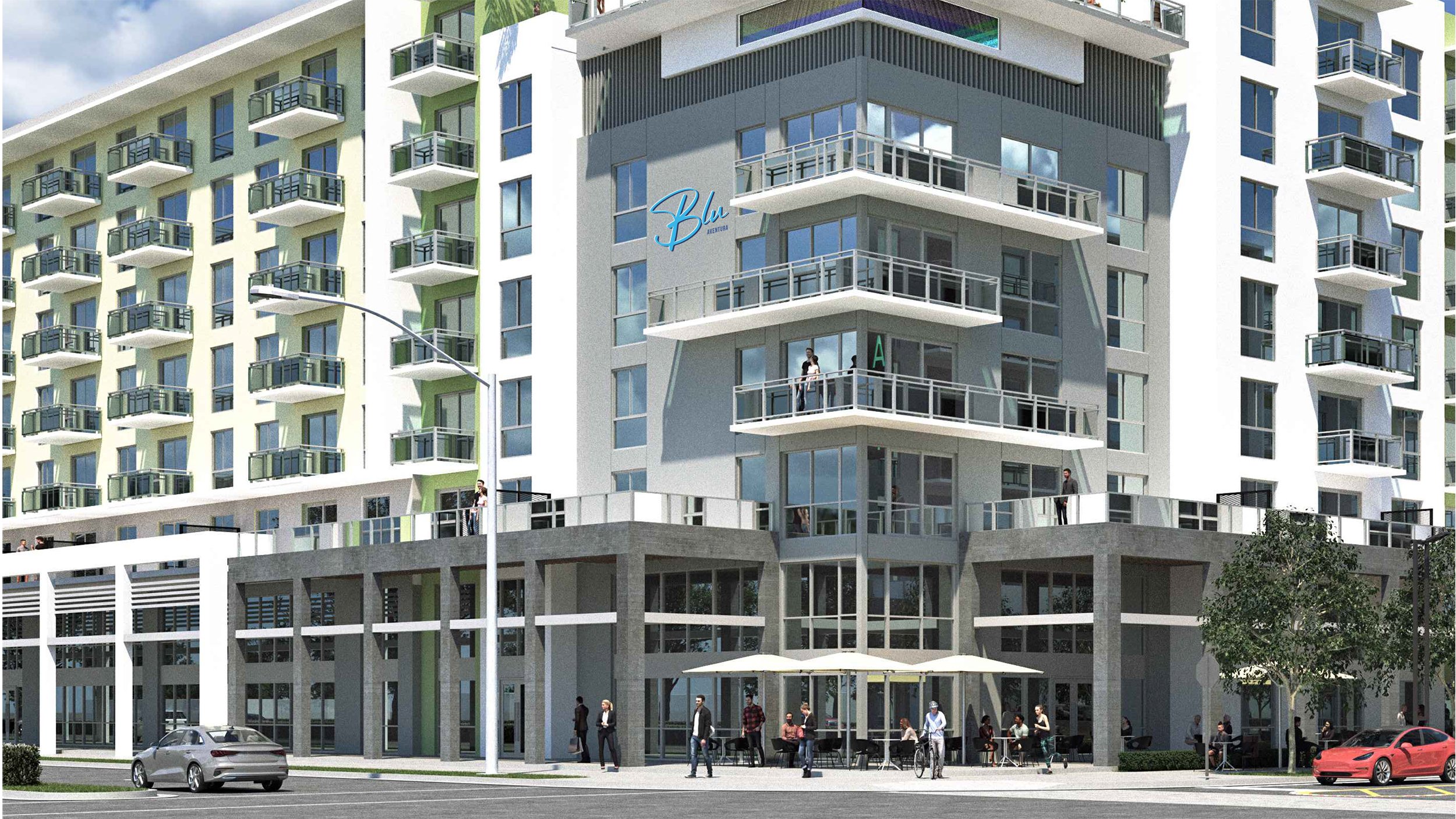
Blu Aventura
Vibrant, Sexy, Cool & Comfortable
OUR TARGET AUDIENCE
Miami's Young Professionals
Could live anywhere but choose the Aventura setting for its character, diversity, metropolitan culture and inspiration
Educated, ambitious and confident
Not yet ready to settle down and expects a comfortable active urban living experience with modern amenities
Appreciates an Instagramable lifestyle that offers convenience and vibrancy of a diverse community
Chooses meaningful experiences while enjoying traditional luxury and maintaining a high expectation for quality

Rejuvenation
Aventura is Miami’s most distinctive community and Blu is an unparalleled apartment community within it. Slow Down to Speed Up. Blü is a comfortable, convenient and vibrant in equal measure. Blü brings the spirit of its surroundings, the looks and luxuries that add to life's adventures.
Right Where You
Need to Be
A unique retreat in one of Aventura’s coolest conveniently located community.
Bright & New
A youthful, energetic and vibrant culture with all Aventura has to offer.
A Home for Everyone
Walkable to a rich collection of trendy restaurants, galleries, retail, recreation and employment
Designed to Make Life Easier
In-unit essentials, an impressive suite of amenities and conveniences and pets are welcome.
Suited for the Aventura Lifestyle
Balancing form and function, Blu features brand new finishes, quality fixtures and modern appliances in every unit. You can also spend time downstairs hanging out, or using our multi-purpose room for business or entertainment.
And, of course, the building’s indoor parking makes all the difference in Miami summers.