

Identity Guidelines
January 2026

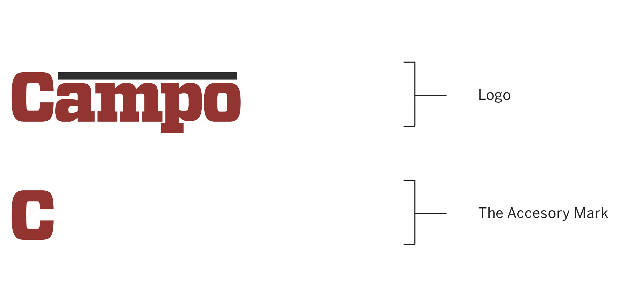
The Campo Roof identity system is comprised of:
The Logo
The Accesory Mark
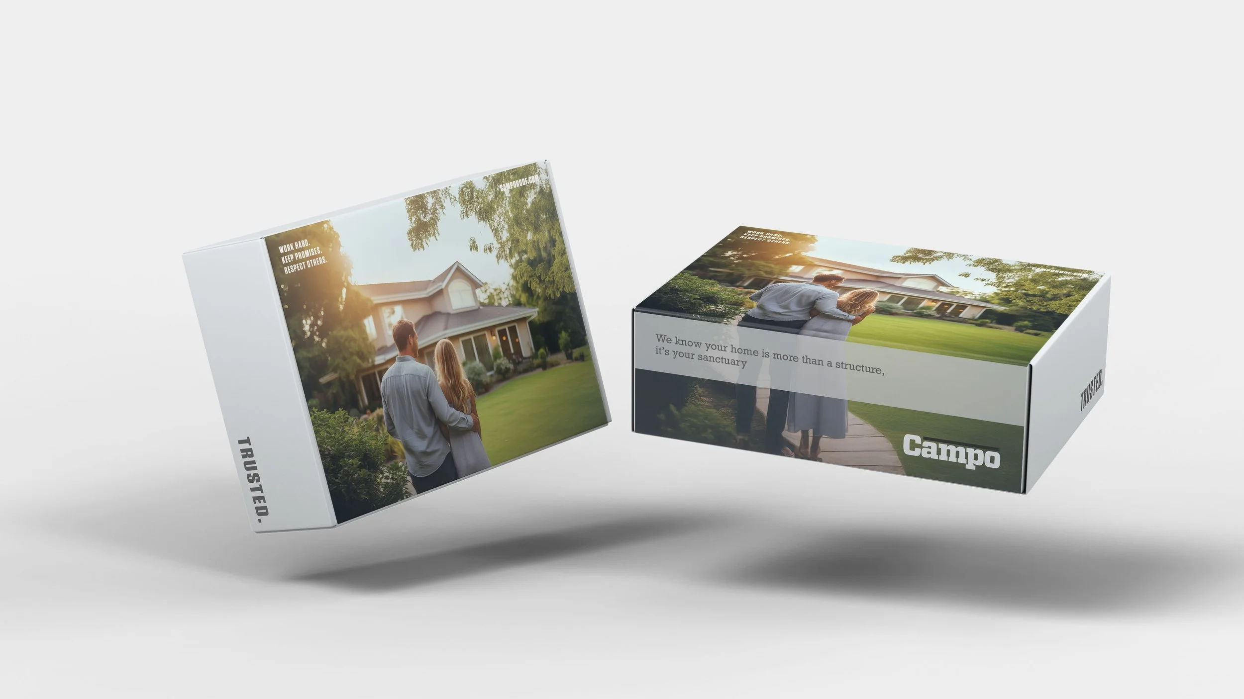
The identity system must be used on all corporate stationery items: letterhead, envelopes, business cards, and communications materials.
Download Printable Identity Guidelines Here
A printable version of these online guidelines is available below.
Download The Campo Logo Library Here
This collection of logos should be utilized when referring to Campo Roof.
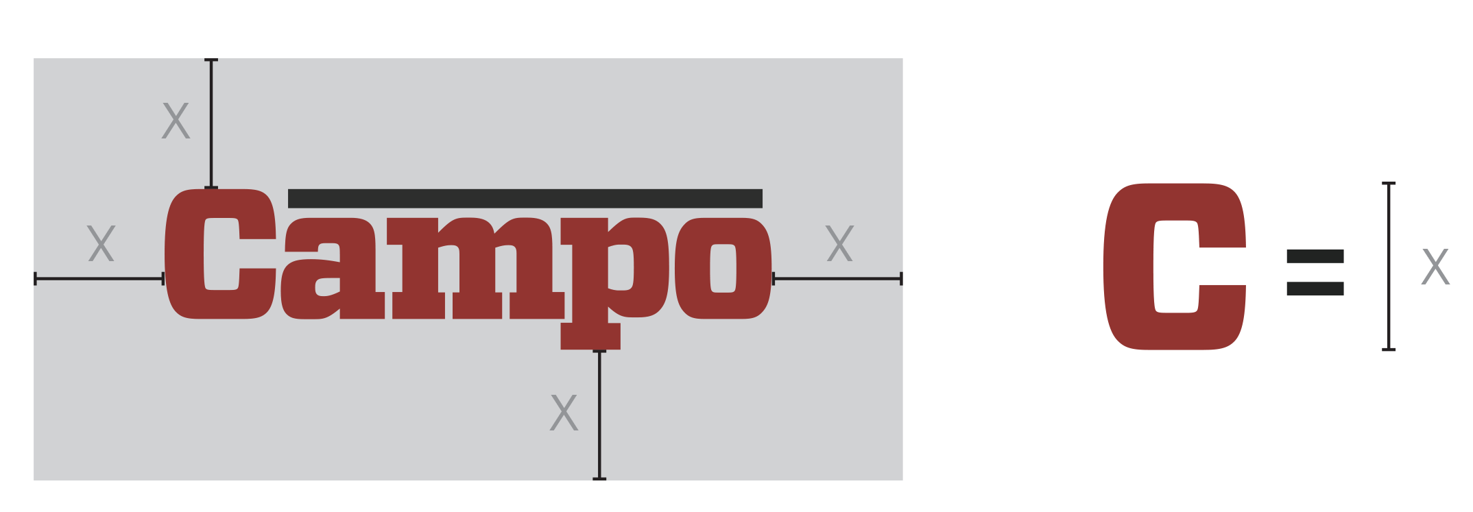
Area of Isolation
To create maximum impact, the space around the logo should be free from other text and graphics. The area of isolation is the designated clear space around the logo no matter what size the logo is placed. When placing the logo on any material, the area of isolation must be accommodated. The guides represent this safety area.
In any of the versions of the logo, the area of isolation is based on X, which is the height of the S in the logotype.
Color
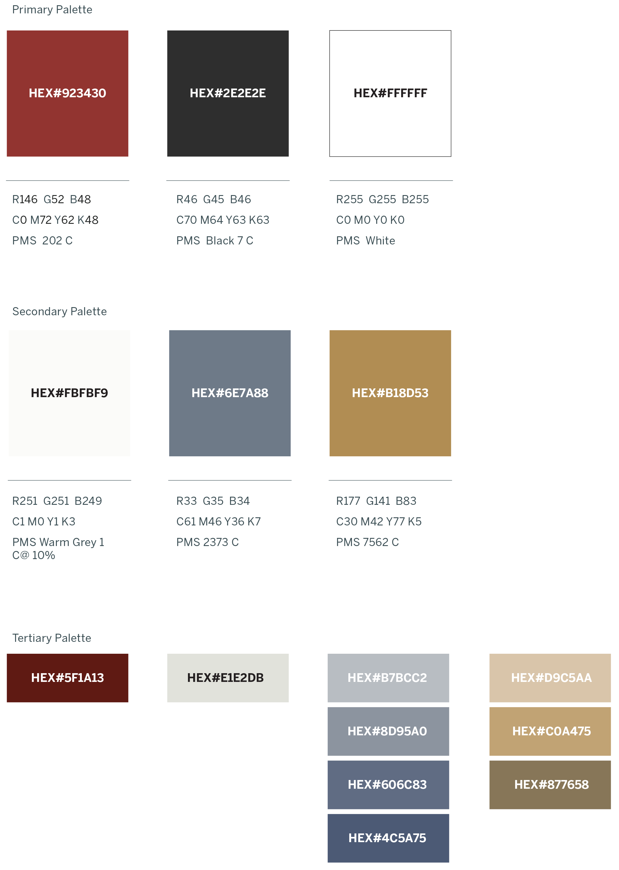
Color Application
The distinctive elements of the Campo Roof identity is further distinguished by its color. Color plays a significant part in shaping the Campo Roof brand. The color palette consists of two primary colors, a dark blue, and a light blue grey. The preferred reproduction is in matching inks. Swatches should be used for visual match in offset printing and other reflective reproduction techniques. Use the full color treatment of the logo on fields of cream whenever possible, as this maximizes the impact of the brand and more effectively supports brand recognition.
Where it is not possible to use the full color treatment of the logo, the one-color presentations of the logo on fields of white are permitted. The black-and-white logo is used for applications that do not warrant the expense of color reproduction or when convention calls for black-and-white reproduction. In one-color marketing and product literature, the ideal one-color application of the logo is reversed to white, or black..


Color Specifications
Use the full-color treatment of the logo on white whenever possible, as this optimizes the impact of the brand and more effectively supports brand recognition. For maximum visibility, the full-color logo should appear on a white background. It is also very effective when shown in white reversed out of the primary palette.
Electronic & Video
Color created through transmitted light on a monitor or a television screen is composed of three primary colors: red, green and blue (RGB). RGB color is produced electronically, the overall color quality will tend to be more vivid than the printed color.
Please note: electronic color is more subjective than printed color. Temporary changes of light source, reflection from adjacent objects, manufacturer and age of screen all affect the color appearance.
Usages to Avoid

Never violate the area of isolation.

Never add any marking signatures.
Ensure sufficient contrast for proper identification.
Never distort, recolor, skew or redraw the logo. Never alter the logo variations in any way.

Do not add shadows, glows, or any effect to logo.

Never diagonally rotate or flip the logo.

Typography
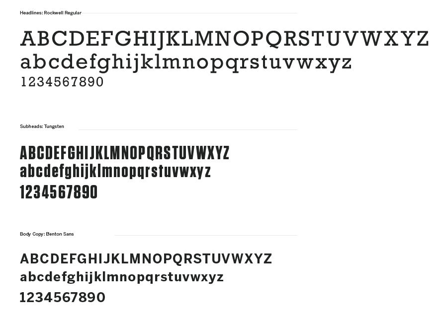
Typography
The primary typeface for headlines is Rockwell. All sub-headlines should be Tungsten and body copy should be set in Benton Sans.
These typefaces are to be used for corporate applications such as the letterhead system, business cards, form titles, and signage. In addition, digital and print advertising should utilize the same typefaces.
Massilia is available for purchase at:
Rockwell:
myfonts.com/collections/rockwell-font-monotype-imaging
Tungsten: typography.com/fonts/tungsten/overview
Benton Sans: myfonts.com/fonts/fontbureau/benton-sans

Logo Downloads
Choosing a File Type
The correct use of the Campo identity is one responsibility we all share. Reproduction artwork is provided for easy use. Before choosing the file format, confirm the final use of the logo.
Vector Files
Vector files are used for print reproduction and for incorporation into Microsoft software applications (e.g. Word and PowerPoint). Vector files may be scaled up and down within an unlimited specified size range. (EPS, PDF)
Bitmap Image Files
Bitmap files are composed of pixels for use on a display screen. These files are composed in CMYK (cyan, magenta, yellow, black) & RGB (red, green, blue) for use in interactive, video or TV applications. These files should not be enlarged, as a jagged edge will appear. Never use a bitmap file for print reproduction. (JPG, PNG)
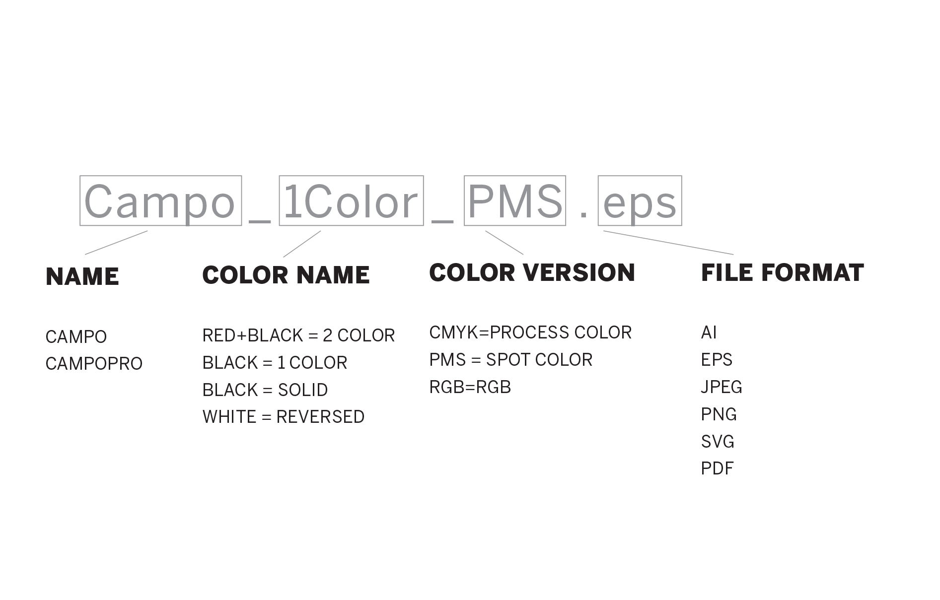
Logo Library File Naming
Please refer to this guide for logo file naming.
(CMYK: Process Color, RGB: On-Screen Color, PMS: Pantone Color, REV: Solid White, BW: Solid Black and Greyscale: Greyscale)
The Campo Logo Library
This collection of logos should be utilized when referring to Starling.