

Identity Guidelines
May 2020

Target Audience
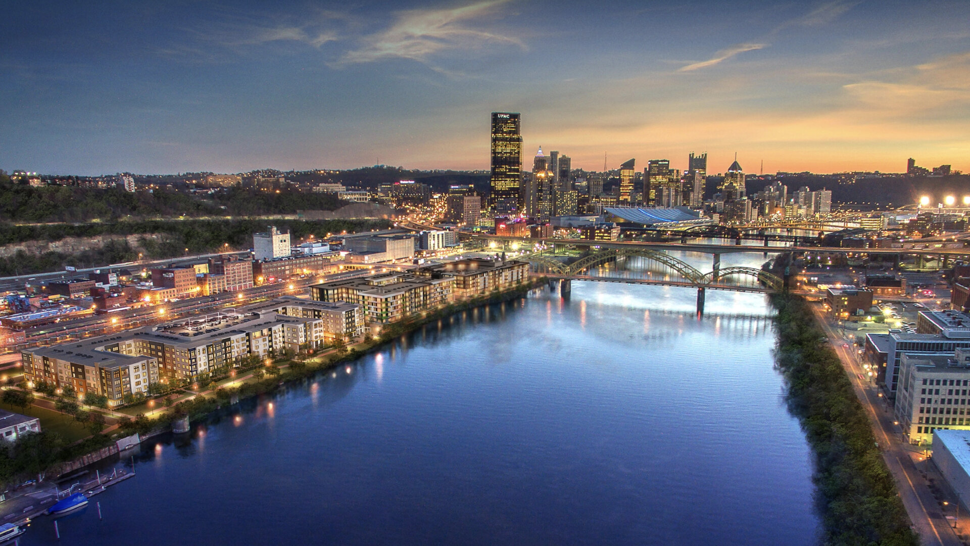
Pittsburgh's Young Professionals
Could live anywhere but chooses an urban setting for its character, diversity, culture and inspiration
Educated, ambitious and confident
Not yet ready to settle down and expects a comfortable urban living experience with modern amenities
Appreciates an Instagramable lifestyle that offers the rush of the city
Chooses meaningful experiences while enjoying traditional luxury and maintaining a high expectation for quality
Value Propositions
An Enclave
A unique retreat in one of Pittsburgh's coolest, authentically urban neighborhoods
City Centered
Walking distance to a robust collection of trendy restaurants, galleries, retail, recreation and employment
Achiever Lifestyles
Versatile spaces and services for professionals working at the office or at home
Comfortable Living
In-unit essentials, an impressive suite of amenities and conveniences and pets are welcome
New and Old Fashion
A blend of the history with a new, youthful, energetic and vibrant culture
The River
The vibe of the water and a built-in change of scenery
District Mission
To enrich people's lives no matter how they choose live them. The District vision is a place where people have the space they need to explore and thrive.
District Values
Style – Inspiration. Present Day.
Excellence – Great care. Attention to detail.
Thriving – Living fully. Flourishing.
Service – Receptive. Delightful experiences.

The District identity system is comprised of:
The Logo Mark
The District Logo
The District Logotype
Use The District logo in instances referring to the apartments. The logo mark may be used without typography where the logo is not required/necessary. For example, use logo mark in instances such as social media profiles images.
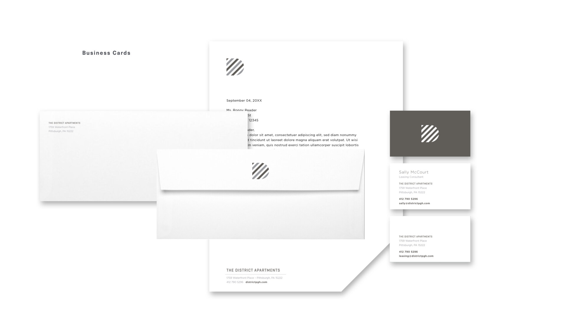
The identity must be used on all corporate stationery items: letterhead, envelopes, business cards, and communications materials. In instances where logo is ineffective or not appropriate, the logo mark may be utilized
to represent District.
Area of Isolation
To create maximum impact, the space around the logo should be free from other text and graphics. The area of isolation is the designated clear space around the logo no matter what size the logo is placed. When placing the logo on any material, the area of isolation must be accommodated. The guides represent this safety area.
In any of the versions of the logo, the 1/2 X area of isolation is based on X, which is the height of the D logomark. The logomark alone however can be placed with an area of isolation that is 1/2 X which is the height of the D logomark.

Color

Color Application
The distinctive shape of The District logo is further distinguished by its color. Color plays a significant part in shaping The District identity. The color palette consists of two primary colors, PMS Cool Grey 7 C a dark PMS Black C. The preferred reproduction is in matching inks. Swatches should be used for visual match in offset printing and other reflective reproduction techniques. Use the full color treatment of the logo on fields of cream whenever possible, as this maximizes the impact of the brand and more effectively supports brand recognition.
Where it is not possible to use the full color treatment of the logo, the one-color presentations of the logo on fields of white are permitted. The black-and-white logo is used for applications that do not warrant the expense of color reproduction or when convention calls for black-and-white reproduction. In one-color marketing and product literature, the ideal one-color application of the logo is reversed to white, or black.

Color Specifications
Use the full-color treatment of the logo on fields of cream whenever possible, as this optimizes the impact of the brand and more effectively supports brand recognition. For maximum visibility, the full-color logo should appear on a white or light-colored background. It is also very effective when shown in white reversed out of the primary palette.
Electronic & Video
Color created through transmitted light on a monitor or a television screen is composed of three primary colors: red, green and blue (RGB). RGB color is produced electronically, the overall color quality will tend to be more vivid than the printed color.
Please note: electronic color is more subjective than printed color. Temporary changes of light source, reflection from adjacent objects, manufacturer and age of screen all affect the color appearance.
Color Palette
Primary Color Palette
The color palette consists of two primary colors PMS Cool Grey 7 and a PMS Black. Please refer to the color chart when using The District complimentary colors. If the piece is part of a four-color process reproduction, the colors should be created with CMYK screen tints. If the identity is part of an electronic medium such as the web, broadcast or PowerPoint, the colors should be created with RGB values. Swatches, PMS Cool Grey 7 and a PMS Black should be used for visual match in offset printing and other reflective reproduction techniques. The preferred reproduction is in matching inks.


Trade Dress
The District Trade Dress
The District Trade Dress utilizes both the black and the grey in an alternating pattern further distinguishing the overall identity.
Building 1 Trade Dress
Building 1 utilizes the same diagonal pattern but created only with the grey color from the identity system. It is utilized in situations specifically talking about or referring to Building 1 and not the apartment complex in its entirety
Building 2 Trade Dress
Building 2 utilizes the same diagonal pattern but created only with the black color from the identity system. It is utilized in situations specifically talking about or referring to Building 2 and not the apartment complex in its entirety.

Reverse Treatment
The reverse (or white) logo is to be utilized over high contrast photography or solid dark colors. This can appear either as a completely white graphic or with color accents. For example: collateral covers, advertising, product labeling, etc.

Usages to Avoid

Never violate the area of isolation.

Never add any marking signatures.

Ensure sufficient contrast for proper identification.

Never distort, recolor, skew or redraw the logo. Never alter the logo variations in any way.

Do not add shadows, glows, or any effect to logo.

Never diagonally rotate or flip the logo.
Typography

Typography
The typographic style relies on a few typefaces. Geogrotesque and Engravers MT are used in the logo, Gotham and RIFT are used for content. Different weights of Gotham can be used for headline and sub-headline applications, body copy and pull quotes. This typeface is to be used for corporate applications such as the letterhead system and business cards, form titles, and signage. In addition, digital and print advertising should utilize the same typeface — except for campaigns.
Faces are available for purchase at:
https://www.myfonts.com/fonts/linotype/geogrotesque
https://www.typography.com/fonts/gotham
https://www.myfonts.com/fonts/mti/engravers-mt
https://fonts.adobe.com/fonts/rift
Typographic Hierarchy Demonstration

Logo Downloads
Choosing a File Type
The correct use of The District identity is one responsibility we all share. Reproduction artwork is provided for easy use. Before choosing the file format, confirm the final use of the logo.
Vector Files
Vector files are used for print reproduction and for incorporation into Microsoft software applications (e.g. Word and PowerPoint). Vector files may be scaled up and down within an unlimited specified size range. (EPS, PDF)
Bitmap Image Files
Bitmap files are composed of pixels for use on a display screen. These files are composed in CMYK (cyan, magenta, yellow, black) & RGB (red, green, blue) for use in interactive, video or TV applications. These files should not be enlarged, as a jagged edge will appear. Never use a bitmap file for print reproduction. (JPG, PNG)
Logo Library File Naming
Please refer to this guide for logo file naming.
(CMYK: Process Color, RGB: On-Screen Color, PMS: Pantone Color, WHITE: Solid White, BLACK: Solid Black)


Logo Mark
This logo mark represents The District
apartments.


The Logo
This collection of logos should be utilized when referring to The District apartments.


Trade Dress Pattern
This collection of patterns should be utilized when promoting The District apartments.
For Buildings 1 and 2
This collection of patterns should be utilized when promoting either Building 1 or Building 2 apartments individually.


Web Copy
HOME INTRO
The District
The Strip District is Pittsburgh's most distinctive neighborhood and The District is an unparalleled apartment community within it. A modern riverfront enclave amidst the hum of the city's Tech, Ed, Med and culture, The District offers two distinct living spaces to meet the speed and needs of your city life.
