Identity Guidelines
May 2024

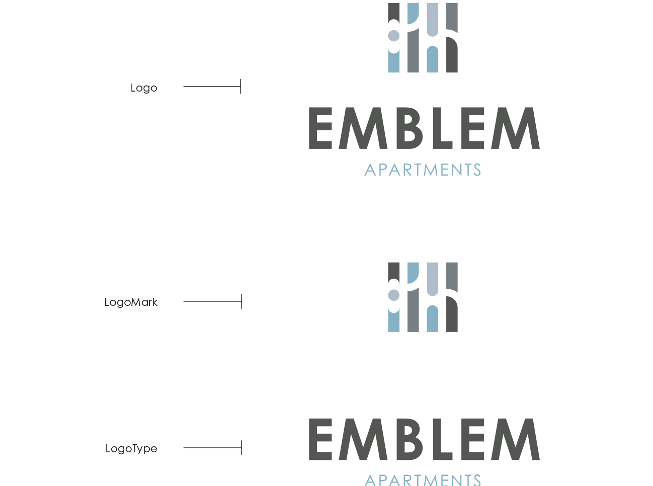
The Emblem identity system is comprised of:
The Logo
The LogoType
The LogoMark
The identity system must be used on all corporate stationery items: letterhead, envelopes, business cards, and communications materials.
Download Printable Guidelines Here
A printable version of these online guidelines is available below.
Area of Isolation
To create maximum impact, the space around the logo should be free from other text and graphics. The area of isolation is the designated clear space around the logo no matter what size the logo is placed. When placing the logo on any material, the area of isolation must be accommodated. The guides represent this safety area.
In any of the versions of the logo, the area of isolation is based on X, which is the half the height of the logo mark, or when using the logotype alone, utilize the cap height of the E.

Color
Color Application
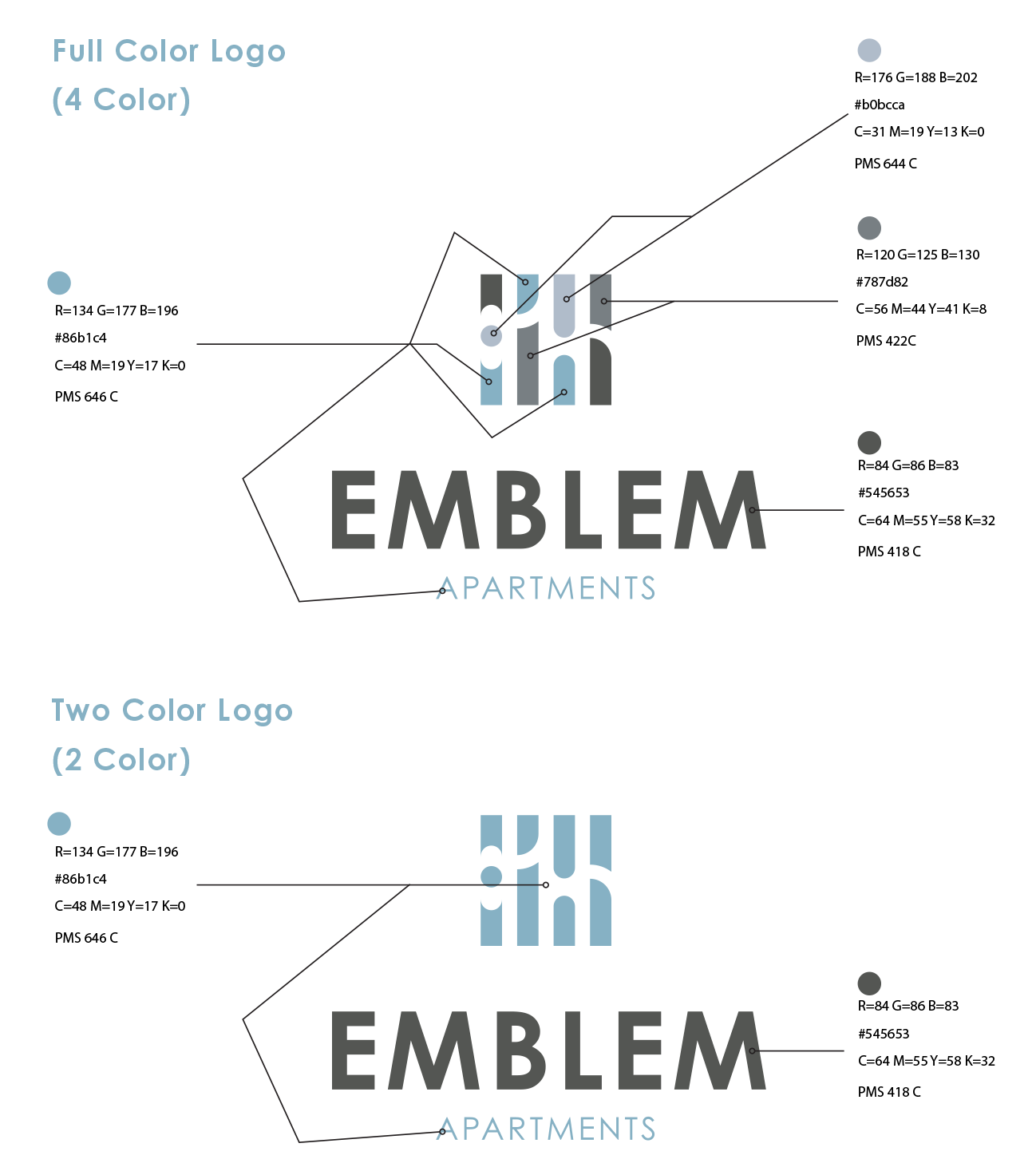
The distinctive elements of Emblem Apartments identity is further distinguished by its color. Color plays a significant part in shaping the Emblem brand. The color palette consists of four primary colors, a dark blue, a light blue, a dark grey and a light grey. The preferred reproduction is in matching inks. Swatches should be used for visual match in offset printing and other reflective reproduction techniques. Use the full color treatment of the logo on fields of cream whenever possible, as this maximizes the impact of the brand and more effectively supports brand recognition.
A two color logo may be used in instances where Pantone colors are required and the budget is limited.
Where it is not possible to use the full color treatment of the logo, the one-color presentations of the logo on fields of white are permitted. The black-and-white logo is used for applications that do not warrant the expense of color reproduction or when convention calls for black-and-white reproduction. In one-color marketing and product literature, the ideal one-color application of the logo is reversed to white, or black.


Color Specifications
Use the full-color treatment of the logo on white whenever possible, as this optimizes the impact of the brand and more effectively supports brand recognition. For maximum visibility, the full-color logo should appear on a white background. It is also very effective when shown in white reversed out of the primary palette.
Electronic & Video
Color created through transmitted light on a monitor or a television screen is composed of three primary colors: red, green and blue (RGB). RGB color is produced electronically, the overall color quality will tend to be more vivid than the printed color.
Please note: electronic color is more subjective than printed color. Temporary changes of light source, reflection from adjacent objects, manufacturer and age of screen all affect the color appearance.

Reverse Treatment
The black & white logo is used for applications that do not warrant the expense of color reproduction or when convention calls for black & white reproduction. For example: instruction manuals, black and white advertising, one color labels, etc.
Tradedress
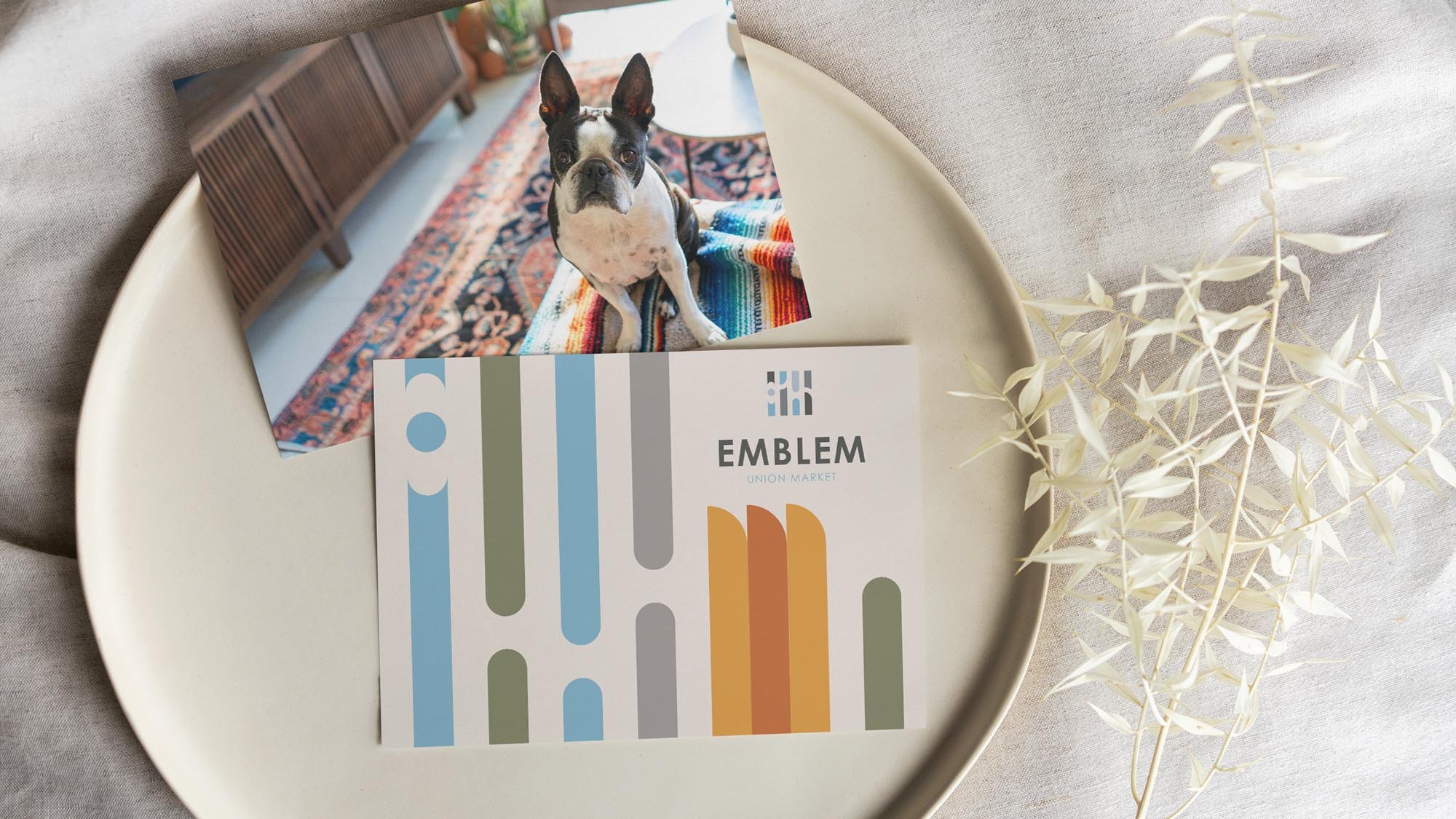
Incorporating corporate trade dress as a cohesive pattern in a set of identity guidelines ensures consistent brand recognition and visual continuity across all marketing and communication materials. This set of shapes and colors can be designed to fit the layout and add a modern edge.
The Emblem Tradedress in RGB
Tradedress graphic elements in RGB.
Usages to Avoid
Never violate the area of isolation.
Never add any marking signatures.
Ensure sufficient contrast for proper identification.
Never distort, recolor, skew or redraw the logo. Never alter the logo variations in any way.
Do not add shadows, glows, or any effect to logo.
Never diagonally rotate or flip the logo.

Typography
Typography
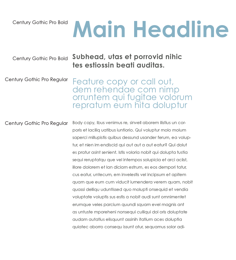
The typographic style relies on a primary typeface of Century Gothic Pro and should primarily be used for headlines, sub-headline applications and pull quotes. These typefaces are to be used for corporate applications such as the letterhead system and business cards, form titles, and signage. In addition, digital and print advertising should utilize the same typeface — except for campaigns.
Century Gothic Pro is available for purchase at:
Typographic Hierarchy Demonstration

Logo Downloads
Choosing a File Type
The correct use of the Emblem identity is one responsibility we all share. Reproduction artwork is provided for easy use. Before choosing the file format, confirm the final use of the logo.
Vector Files
Vector files are used for print reproduction and for incorporation into Microsoft software applications (e.g. Word and PowerPoint). Vector files may be scaled up and down within an unlimited specified size range. (EPS, PDF)
Bitmap Image Files
Bitmap files are composed of pixels for use on a display screen. These files are composed in CMYK (cyan, magenta, yellow, black) & RGB (red, green, blue) for use in interactive, video or TV applications. These files should not be enlarged, as a jagged edge will appear. Never use a bitmap file for print reproduction. (JPG, PNG)
Logo Library File Naming
Please refer to this guide for logo file naming.
(CMYK: Process Color, RGB: On-Screen Color, PMS: Pantone Color, REV: Solid White, BW: Solid Black)
The Emblem Logo Library
This collection of logos should be utilized when referring to the Emblem apartments.
The Emblem Tradedress in RGB
Tradedress graphic elements in RGB.

Brand Language
The Emblem signifies a symbol of pride and achievement, reflecting the project's status as a landmark in the commitment to affordable housing and community empowerment. It underscores the property's role as a beacon of hope and progress, representing the ideals of inclusivity and opportunity that are central to the city's values.
______________________
Design
The Emblem building conveys a sense of refined elegance and modernity. It seemingly aims to create an inviting atmosphere of high-end comfort with a touch of avant-garde artistry, targeting an audience that values both style and substance in their living environment. The intent is to offer a luxurious yet functional space that resonates with upscale urban living.
Minimalist
The use of clean lines, geometric shapes, and modern fixtures convey a contemporary aesthetic.
Modern and Stylish
The color palette is neutral, with a focus on greys, beiges, and browns, which suggests simplicity and understated elegance.
Quality and Luxury
The textures imply a brand that is associated with quality materials and a luxurious feel.
Professional and Sophisticated
The overall design, which includes open spaces, structured furniture, and tailored details, creates a professional and sophisticated atmosphere.
Artistic
The inclusion of unique patterns and artistic elements, like the abstract wallpaper and the creative light fixtures, indicates a brand that wants to make a statement through design.

Welcome to Emblem
Elegance and Access in the Heart of NOMA

For Those Who Dream DC.

Live Where You Belong.

Live Iconically.
Your City, Your Style, Your Emblem.

A pioneering approach to affordable luxury living.
At Emblem, every corner is designed with purpose, every amenity is crafted with quality, and every door opens to a city where you belong and the opportunities you deserve.
Nestled in the dynamic NOMA neighborhood, Emblem is not just a residence but a powerful symbol of progress in affordable housing. Here, inclusivity meets modern luxury, setting a new standard for accessible city living. With its sleek design and community-focused ethos, Emblem is designed to empower its residents and power the community around it.
Floor Plans
Each layout optimizes comfort and functionality. A blend of refined elegance and practical modernity.
Link to Floor plans
Amenities
Emblem enriches your daily experience in every way. Living well is a part of everyday life..
Link to Amenities
Neighborhood
Emblem offers unparalleled access to the vibrant life of the city where you can find opportunities and community at every turn.
Link to Community / Maps
More Than an Amazing Place to Live.
As the first affordable luxury property in the upscale NOMA neighborhood, Emblem sets a new standard in housing excellence. It embodies a transformative vision for community engagement and urban development, where affordability enriches quality, not compromises it. Here, every resident finds a space designed to foster success. Emblem’s strategic location and thoughtful design ensure a perfect balance of comfort, style, and convenience, making it not just a place to live, but a place to thrive.
Comfort and Community for All.
At Emblem, living well is a part of everyday life. Our apartments offer spacious one- and two-bedroom layouts, complete with full kitchens and baths, and all modern finishings and fixtures. Each detail is designed to ensure comfort and style are never compromised.
From our modern fitness center and elegantly appointed communal areas to work and meeting spaces that cater to both personal productivity and professional needs, Emblem enriches your daily experience in every way.
Apartment Amenities >
Community Amenities >
Your Gateway to Exciting DC Life.
Situated in the heart of Washington D.C.'s dynamic NOMA district, Emblem offers unparalleled access to the vibrant life of the city. Just a short stroll from Union Market, top government and educational facilities, and major transportation networks, you benefit from convenient commutes and a wealth of entertainment options right on their doorstep. This prime location merges historical charm with modern convenience, serving as a gateway to a lifestyle enriched by diversity and energy, where each you can find opportunities and community at every turn.
Refined Spaces, Designed for Life
Emblem’s apartments seamlessly blend elegance with practical modernity, designed to enhance the way you live. Each layout maximizes comfort and functionality, catering to those who appreciate both style and efficiency. With clean, modern design and thoughtful finishing touches, our residences offer a sophisticated living space that perfectly suits contemporary urban needs.
Lofts >
Junior One BR >
One BR >
Two BR >


