Identity Guidelines
December 2024


The Seeker identity system is comprised of:
The Logo
The LogoType
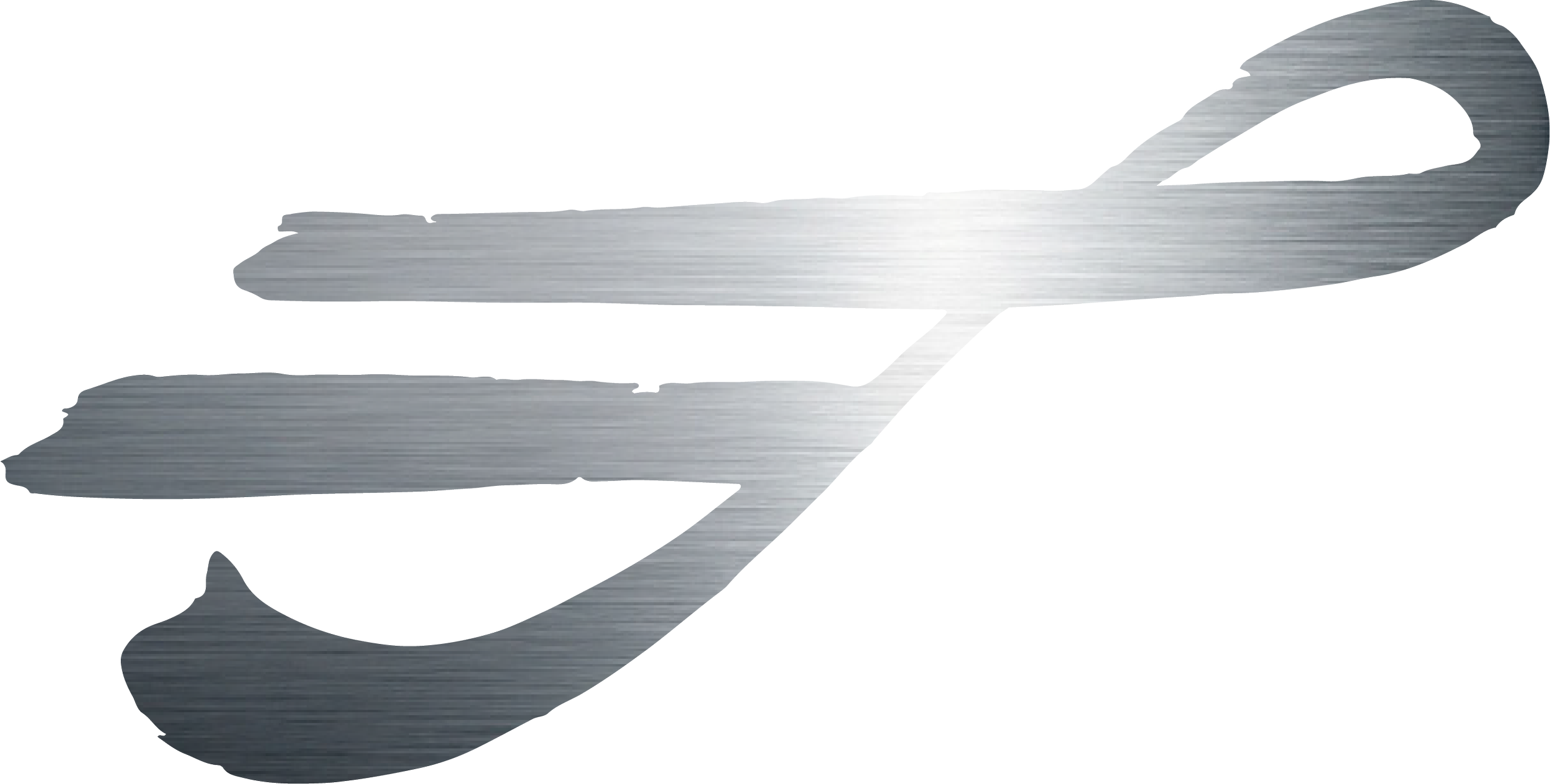
The LogoMark
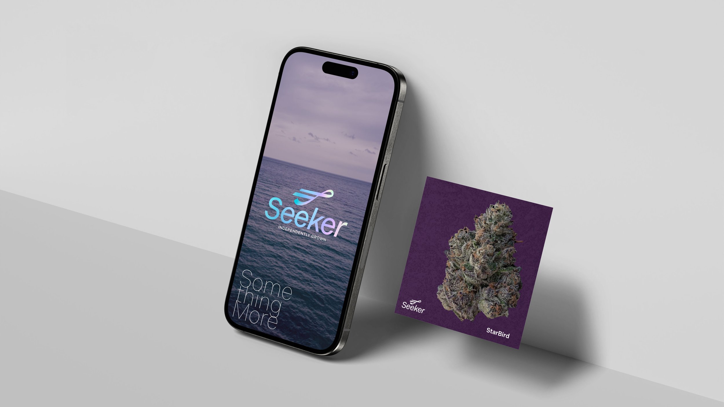
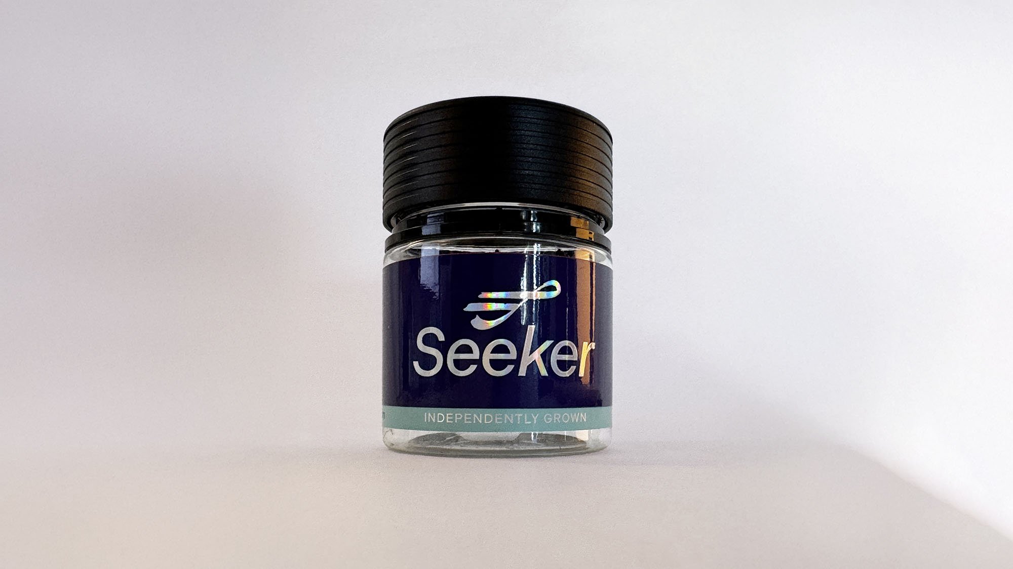
The identity system must be used on all packaging, promotional materials, corporate stationery items: letterhead, envelopes, business cards, and any communications materials.
Area of Isolation
To create maximum impact, the space around the logo should be free from other text and graphics. The area of isolation is the designated clear space around the logo no matter what size the logo is placed. When placing the logo on any material, the area of isolation must be accommodated. The guides represent this safety area.
In any of the versions of the logo, the area of isolation is based on X, which is the half the height of the logo type, or when using the logotype alone, utilize the cap height of the S.


Color

Color Application
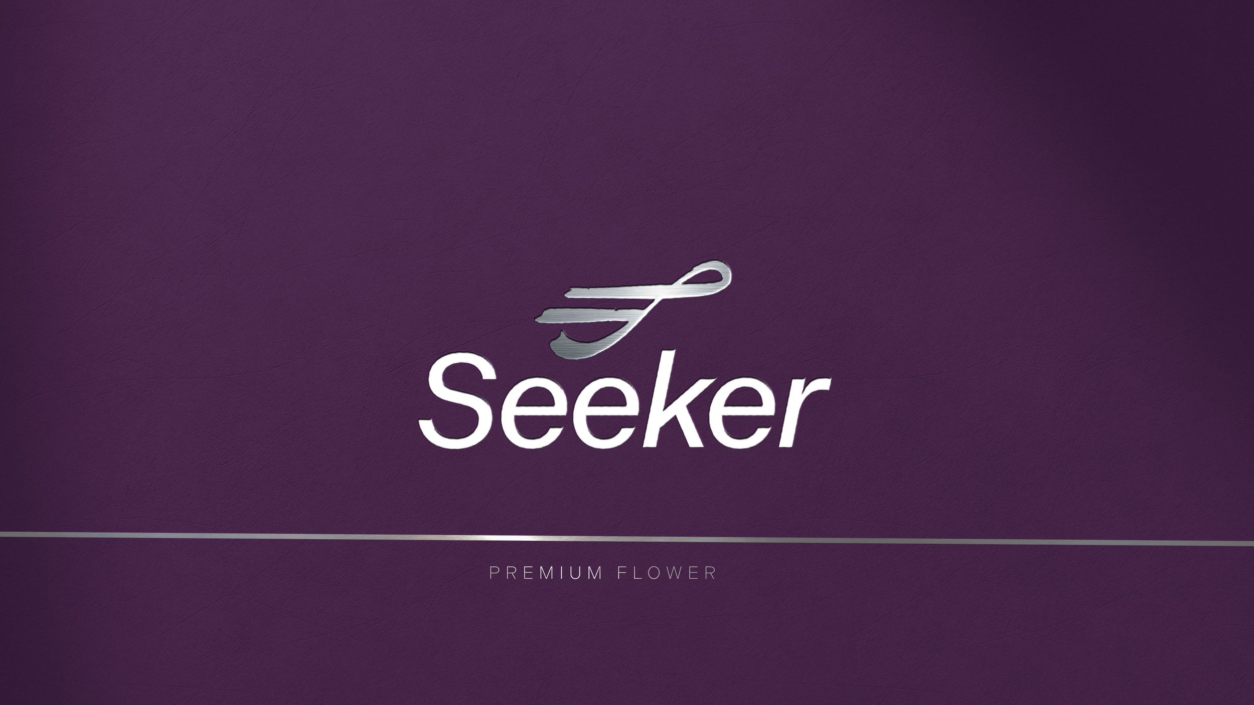
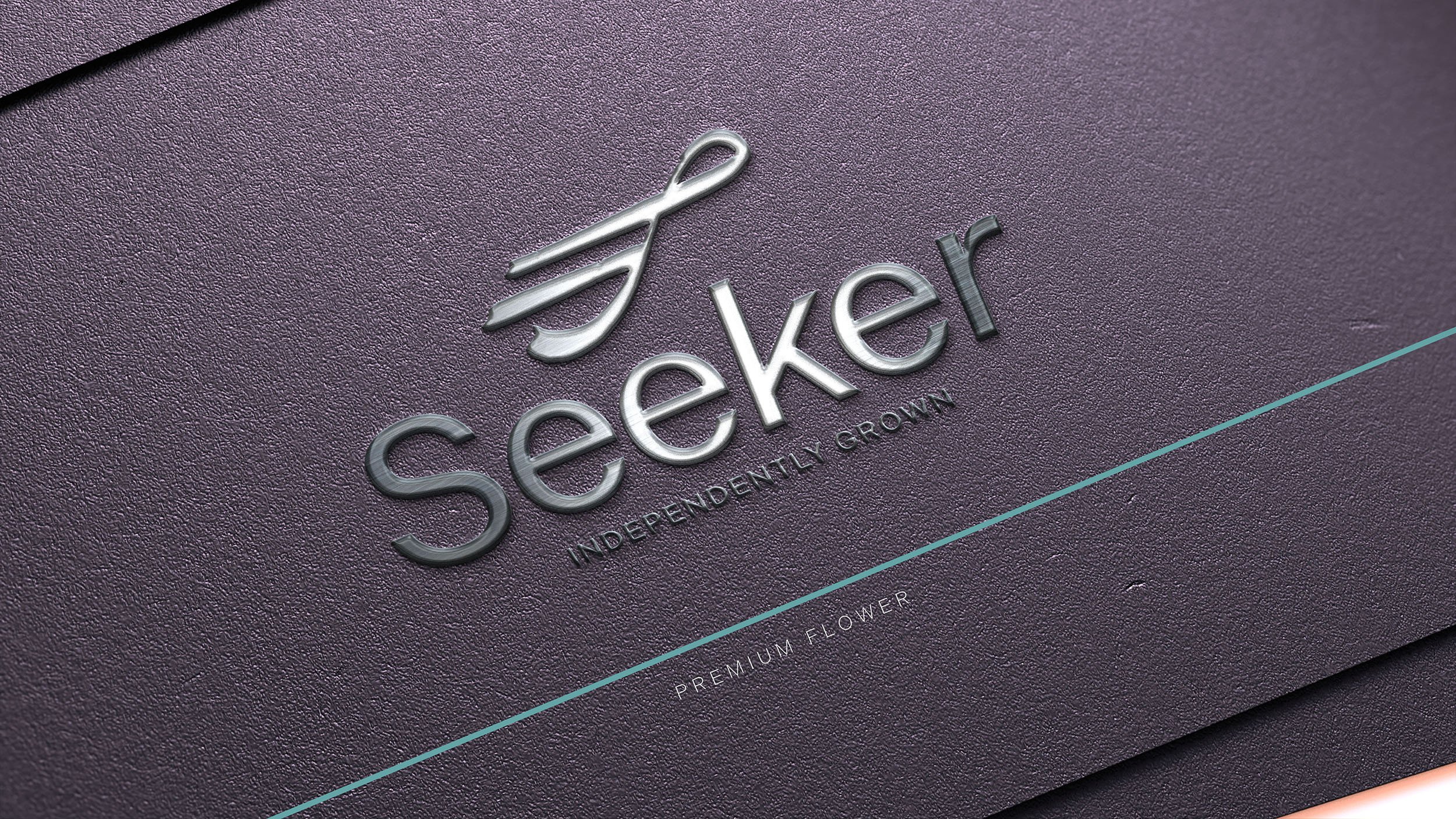
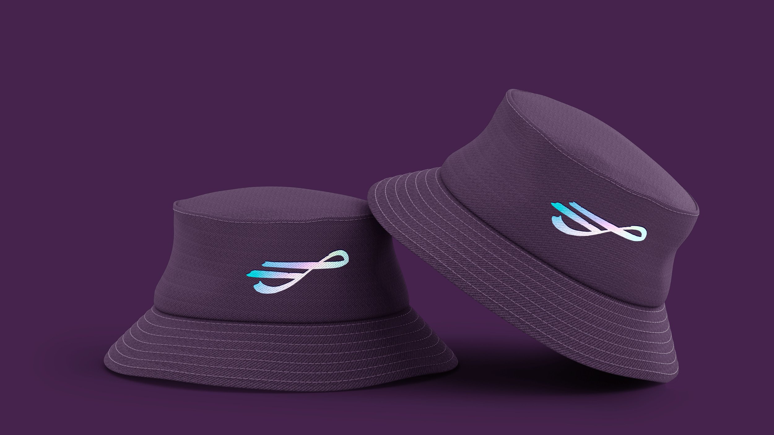
The distinctive elements of the Seeker identity is further distinguished by its color. Color plays a significant part in shaping the Seeker brand. The color palette consists of a dark purple primary color paired with a silver, or halographic texture in the logomark or logotype as an embelishment. Swatches should be used for visual match in offset printing and other reflective reproduction techniques. Use the reversed treatment of the logo on fields of dark purple whenever possible, as this maximizes the impact of the brand and more effectively supports brand recognition.
A one color logo may be used in instances where Pantone colors are required and the budget is limited.
Where it is not possible to use the full color treatment of the logo, the one-color presentations of the logo on fields of white are permitted. The black-and-white logo is used for applications that do not warrant the expense of color reproduction or when convention calls for black-and-white reproduction. In one-color marketing and product literature, the ideal one-color application of the logo is reversed to white, or black.

Reverse Treatment


Color Specifications
Use the full-color treatment of the logo on white whenever possible, as this optimizes the impact of the brand and more effectively supports brand recognition. For maximum visibility, the full-color logo should appear knocked out of the dark purple background. It is also very effective when shown in positive on a white background.
The black & white logo is used for applications that do not warrant the expense of color reproduction or when convention calls for black & white reproduction. For example: instruction manuals, black and white advertising, one color labels, etc.
Electronic & Video
Color created through transmitted light on a monitor or a television screen is composed of three primary colors: red, green and blue (RGB). RGB color is produced electronically, the overall color quality will tend to be more vivid than the printed color.
Please note: electronic color is more subjective than printed color. Temporary changes of light source, reflection from adjacent objects, manufacturer and age of screen all affect the color appearance.

Usages to Avoid

Never violate the area of isolation.

Never add any marking signatures.

Ensure sufficient contrast for proper identification.

Never distort, recolor, skew or redraw the logo. Never alter the logo variations in any way.

Do not add shadows, glows, or any effect to logo.

Never diagonally rotate or flip the logo.
Typography

Typography
The typographic style relies on a primary typeface of Indivisible Variable and should primarily be used for headlines, sub-headline applications and pull quotes. This typeface is to be used for corporate applications such as the letterhead system and business cards, form titles, and signage. In addition, digital and print advertising should utilize the same typeface — except for campaigns.
Indivisible is available for purchase at:
https://fonts.adobe.com/fonts/indivisible-variable
This face can also be used in digital formats by embedding the font from Adobe with a purchased license
.
Alternate Typeface Family
Professionally printed materials should always use the Indivisible family. Roboto (a free Google font) may be used as an alternative typeface when Indivisible is not available.
Roboto is available for download at:
Typographic Hierarchy Demonstration

Brand Templates


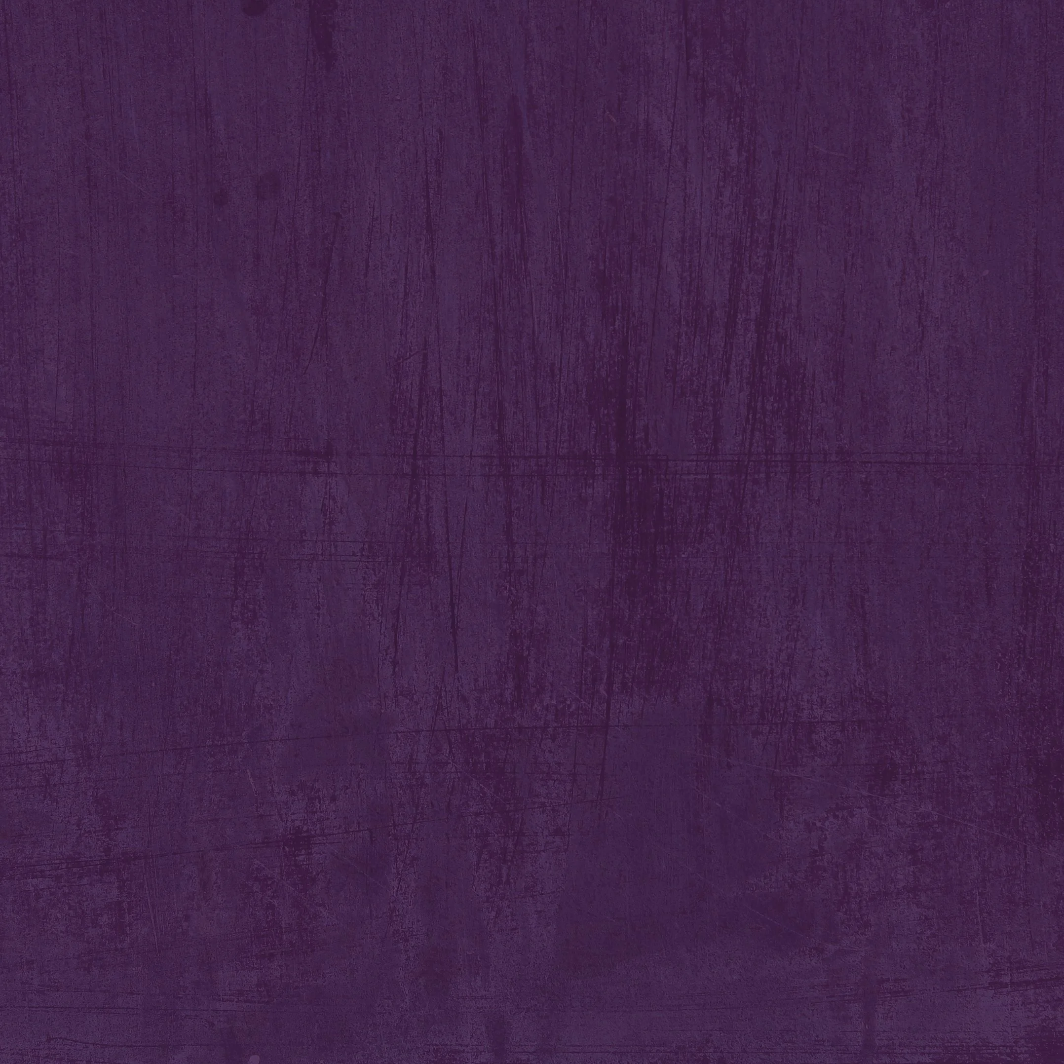


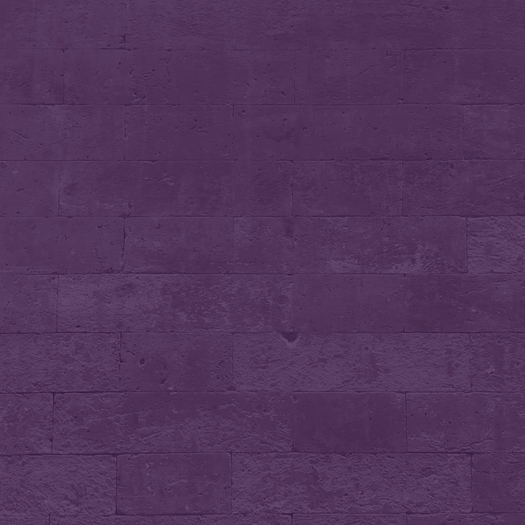
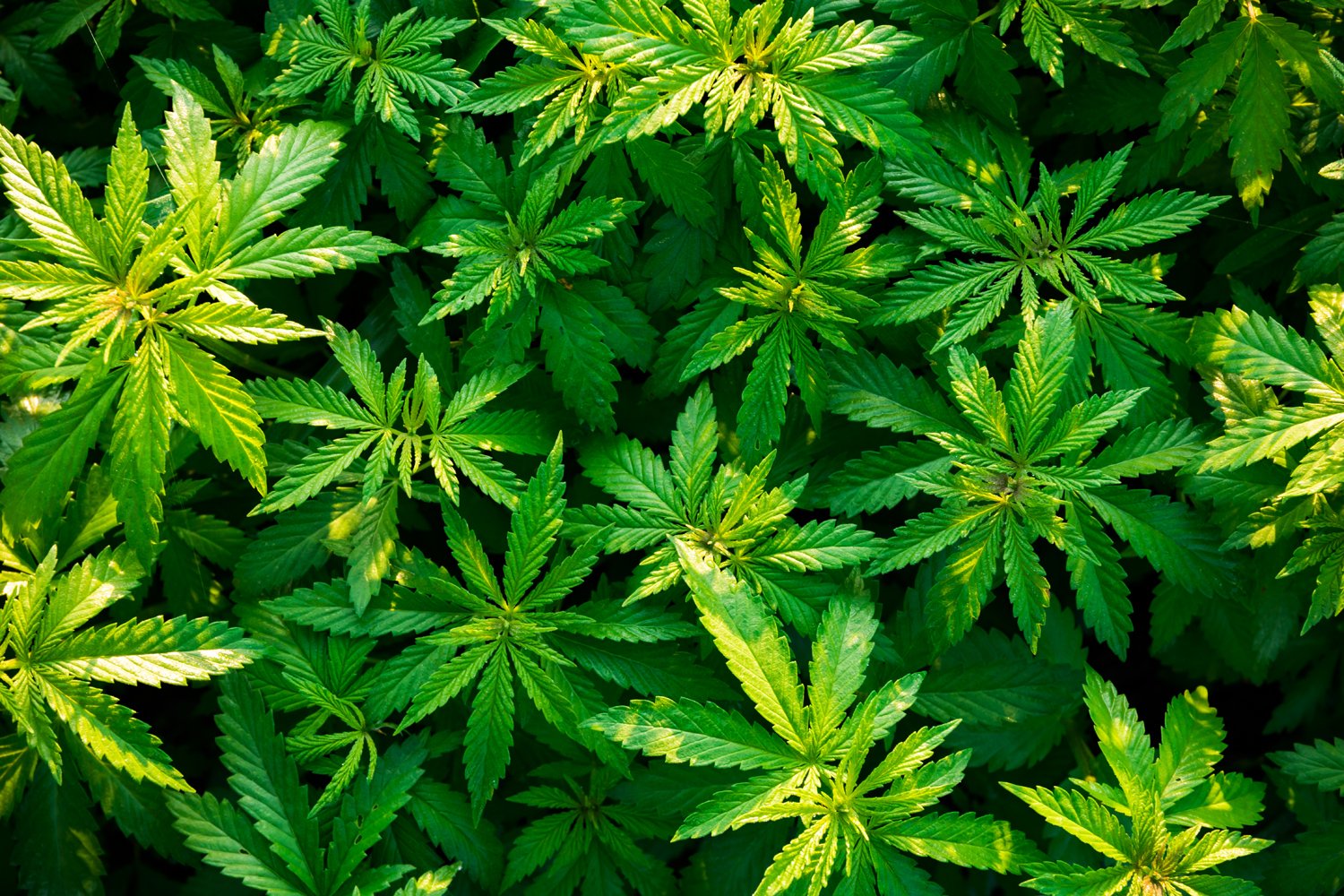
The Seeker Texture Library
This collection of textures can be utilized when promoting to Seeker.
Logo Downloads
Choosing a File Type
The correct use of the Seeker identity is one responsibility we all share. Reproduction artwork is provided for easy use. Before choosing the file format, confirm the final use of the logo.
Vector Files
Vector files are used for print reproduction and for incorporation into Microsoft software applications (e.g. Word and PowerPoint). Vector files may be scaled up and down within an unlimited specified size range. (EPS, PDF)
Bitmap Image Files
Bitmap files are composed of pixels for use on a display screen. These files are composed in CMYK (cyan, magenta, yellow, black) & RGB (red, green, blue) for use in interactive, video or TV applications. These files should not be enlarged, as a jagged edge will appear. Never use a bitmap file for print reproduction. (JPG, PNG)
Logo Library File Naming
Please refer to this guide for logo file naming.
(CMYK: Process Color, RGB: On-Screen Color, PMS: Pantone Color, REV: Solid White, BW: Solid Black)

The Seeker Logo Library
This collection of logos should be utilized when referring to Seeker.