Identity Guidelines
February 2026

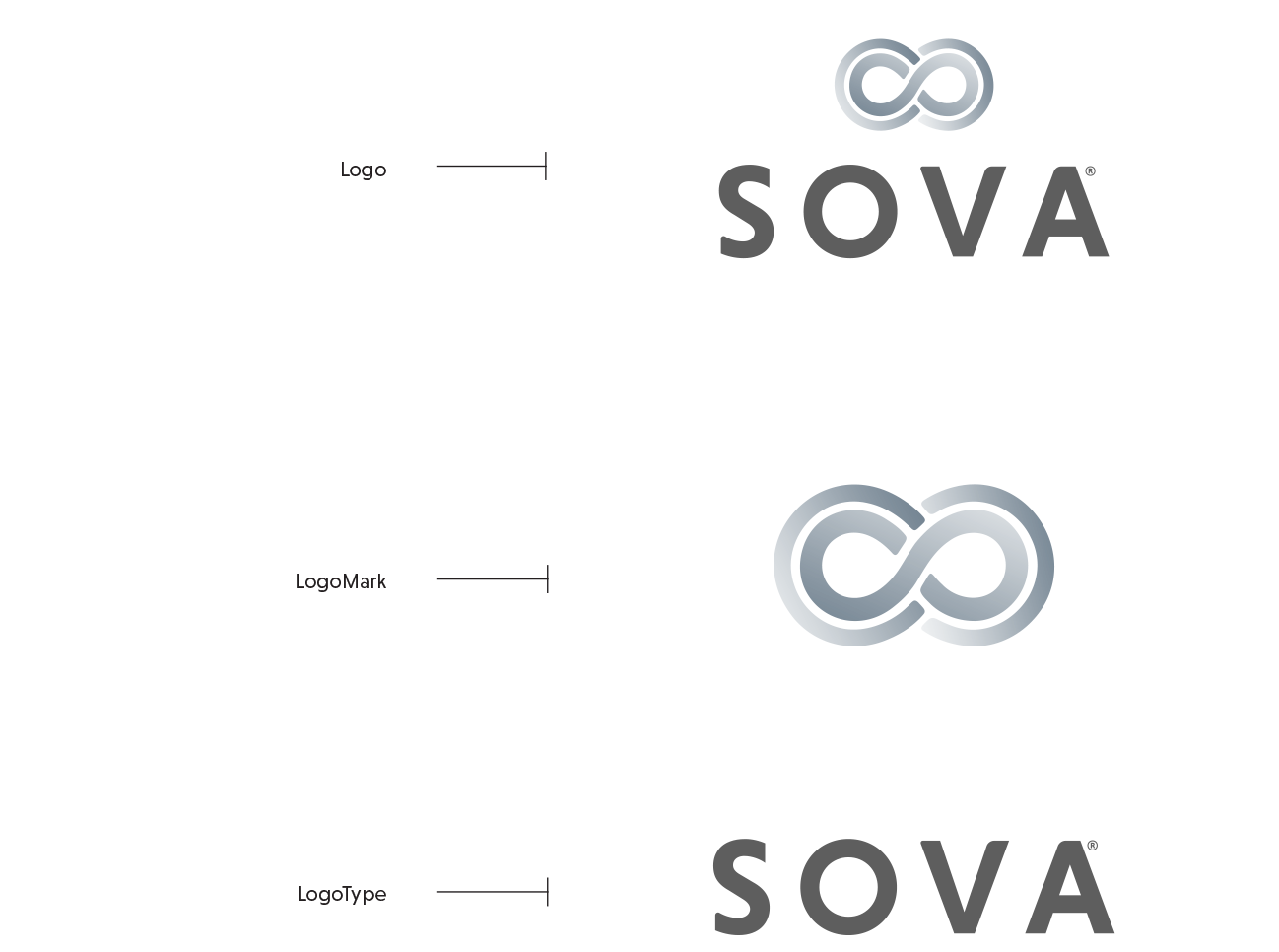
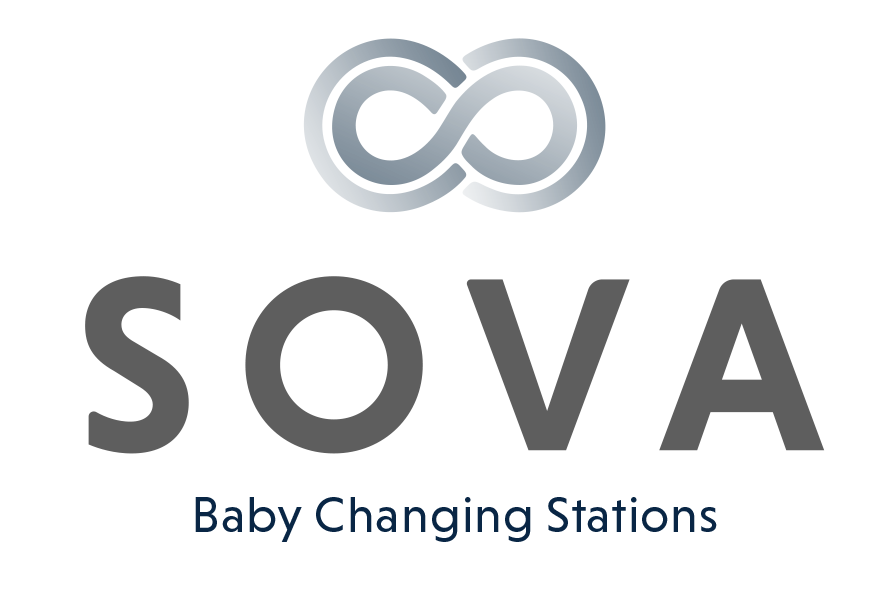
The Sova identity system is comprised of:
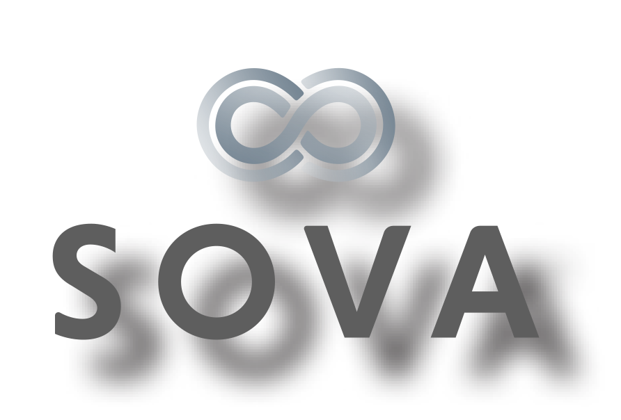
The Logo
The LogoMark
The LogoType
The identity system must be used on all corporate stationery items: letterhead, envelopes, business cards, and communications materials.
Download Printable Identity Guidelines Here
A printable version of these online guidelines is available below.
Download The Sova Logo Library Here
This collection of logos should be utilized when referring to SOVA.
Download Printable Brand Strategy Here
A printable version of our current brand strategy is available.
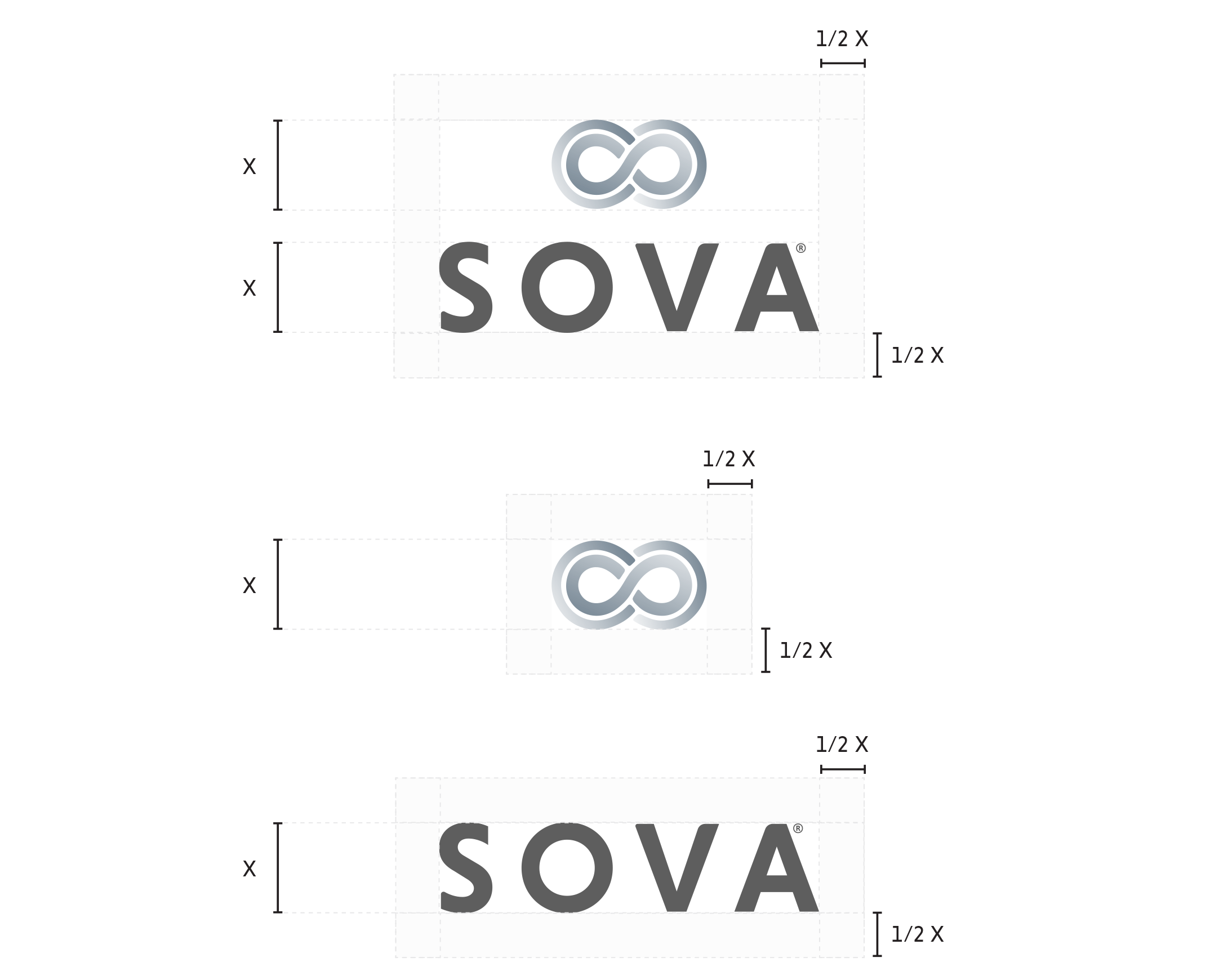
Area of Isolation
To create maximum impact, the space around the logo should be free from other text and graphics. The area of isolation is the designated clear space around the logo no matter what size the logo is placed. When placing the logo on any material, the area of isolation must be accommodated. The guides represent this safety area.
In any of the versions of the logo, the area of isolation is based on X, which is the 1/2 the height of the LogoMark or the cap height of the S, for both the logo, logotype and the logomark.

Color
Color Application
The distinctive elements of the Sova identity is further distinguished by its color. Color plays a significant part in shaping the Sova brand. The color palette consists of three primary colors, a dark blue, a muted blue and a creamy white. The preferred reproduction is in matching inks. Swatches should be used for visual match in offset printing and other reflective reproduction techniques. Use the full color treatment of the logo on fields of cream whenever possible, as this maximizes the impact of the brand and more effectively supports brand recognition.
Where it is not possible to use the full color treatment of the logo, the one-color presentations of the logo on fields of white are permitted. The black-and-white logo is used for applications that do not warrant the expense of color reproduction or when convention calls for black-and-white reproduction. In one-color marketing and product literature, the ideal one-color application of the logo is reversed to white, or black.
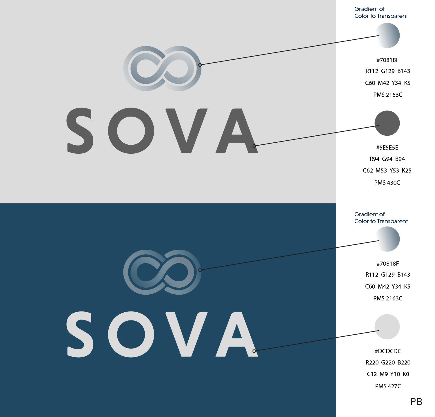

Color Specifications
Use the full-color treatment of the logo on white whenever possible, as this optimizes the impact of the brand and more effectively supports brand recognition. For maximum visibility, the full-color logo should appear on a white background. It is also very effective when shown in white reversed out of the primary palette.
Electronic & Video
Color created through transmitted light on a monitor or a television screen is composed of three primary colors: red, green and blue (RGB). RGB color is produced electronically, the overall color quality will tend to be more vivid than the printed color.
Please note: electronic color is more subjective than printed color. Temporary changes of light source, reflection from adjacent objects, manufacturer and age of screen all affect the color appearance.


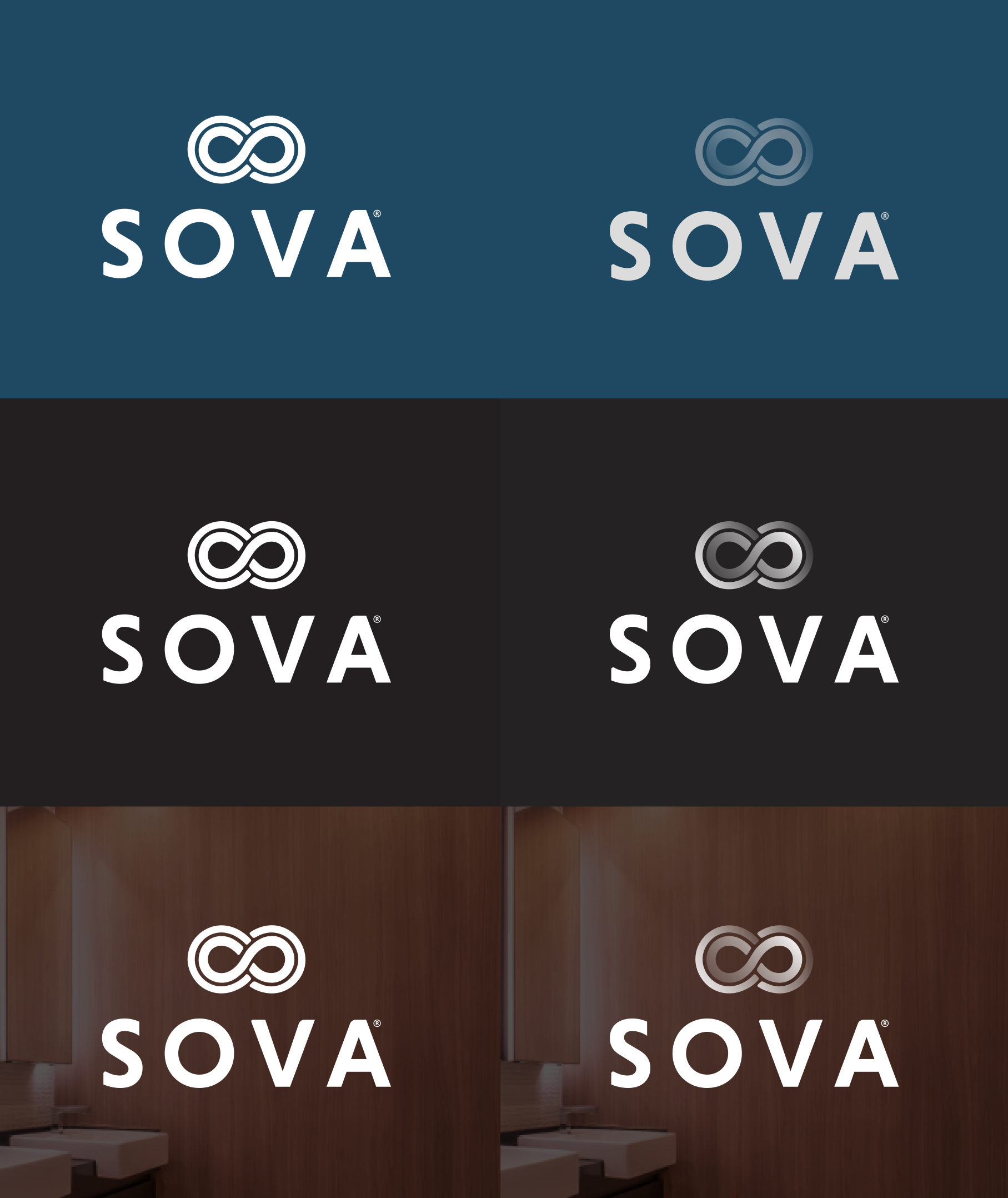
Reverse Treatment
The black & white logo is used for applications that do not warrant the expense of color reproduction or when convention calls for black & white reproduction. For example: instruction manuals, black and white advertising, one color labels, etc.
Usages to Avoid
Never violate the area of isolation.
Never add any marking signatures.
Ensure sufficient contrast for proper identification.
Never distort, recolor, skew or redraw the logo. Never alter the logo variations in any way.
Do not add shadows, glows, or any effect to logo.
Never diagonally rotate or flip the logo.

Typography

Typography
The typographic style relies on primary typefaces of Niveau Grotesk and Adobe Aldine. These should be used for headlines, sub-headline applications and pull quotes.
These typefaces are to be used for corporate applications such as the letterhead system and business cards, form titles, and signage. In addition, digital and print advertising should utilize the same typeface — except for campaigns.
Niveau Grotesk is available for purchase at:
https://fonts.adobe.com/fonts/niveau-grotesk
Adobe Aldine is available for purchase at
Typographic Hierarchy Demonstration


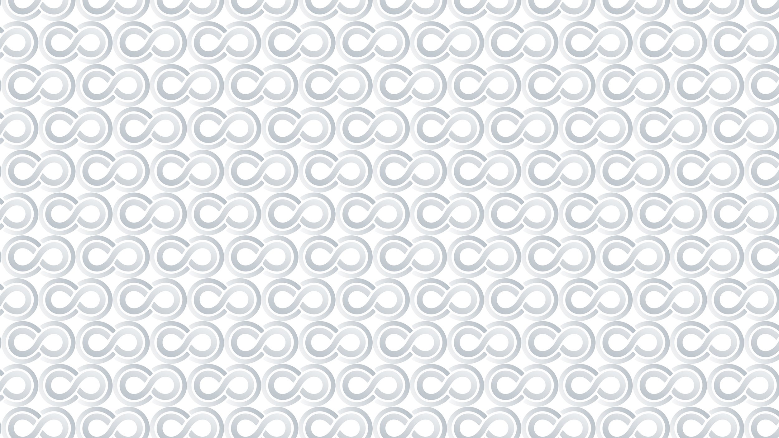
Trade Dress
The SOVA brand utilizes a distinctive pattern inspired by its logo, designed to reinforce and promote brand recognition across various applications.
Guidelines for Using the Sova Pattern:
Contrast and Legibility:
Avoid placing text directly over the pattern to ensure readability and compliance with accessibility standards. Instead, use solid backgrounds for text elements adjacent to the patterned areas.
Color Variations:
The pattern can be rendered using Sova’s primary color palette. Ensure sufficient contrast between the pattern and its background to maintain visual clarity.
Integration with Other Elements:
When combining the pattern with images or other graphics, ensure that the pattern does not overlap or interfere with these elements. The pattern should complement, not compete with, other visual components.
Examples of Proper Pattern Usage:
Background Accent:
Use the pattern as a sidebar or margin accent on brochures, ensuring it does not interfere with the main content.
Product Packaging:
Incorporate the pattern on packaging surfaces where it enhances brand recognition without compromising essential information.
Digital Media:
Apply the pattern in website sidebars or footers, maintaining clear separation from interactive elements and text.
By adhering to these guidelines, the SOVA pattern will consistently enhance brand identity while ensuring visual appeal and functionality across various platforms.


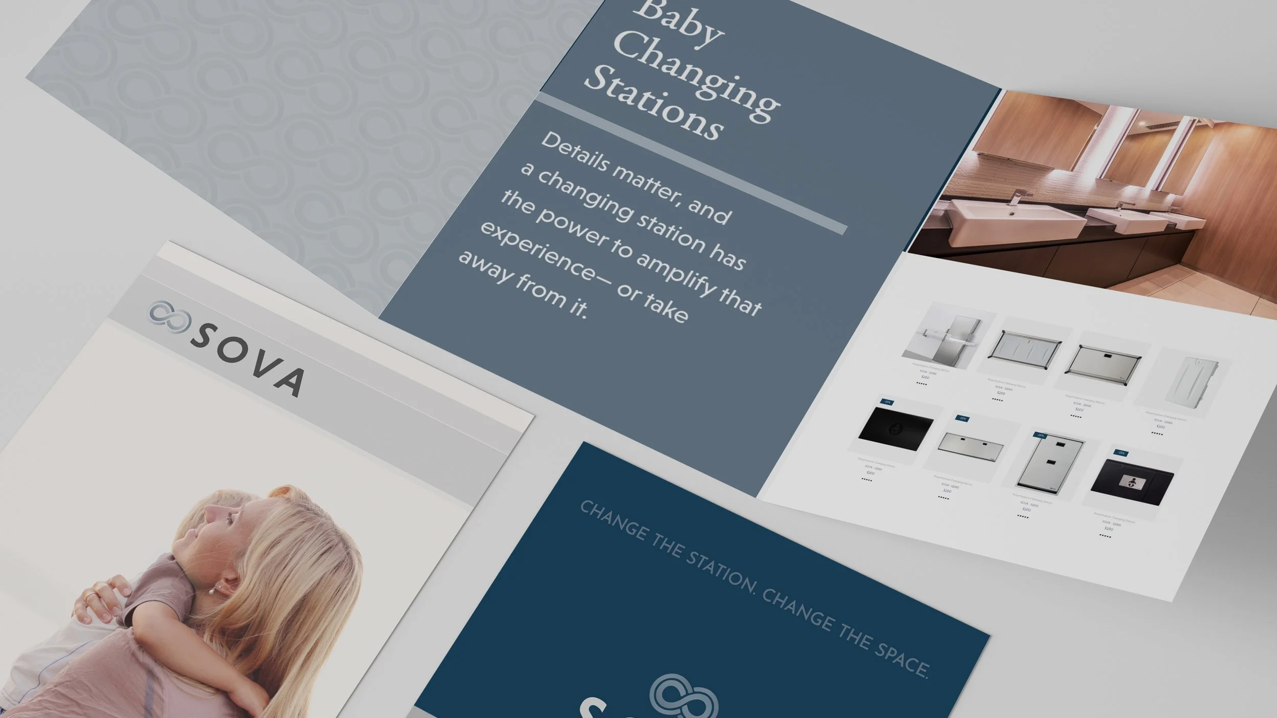
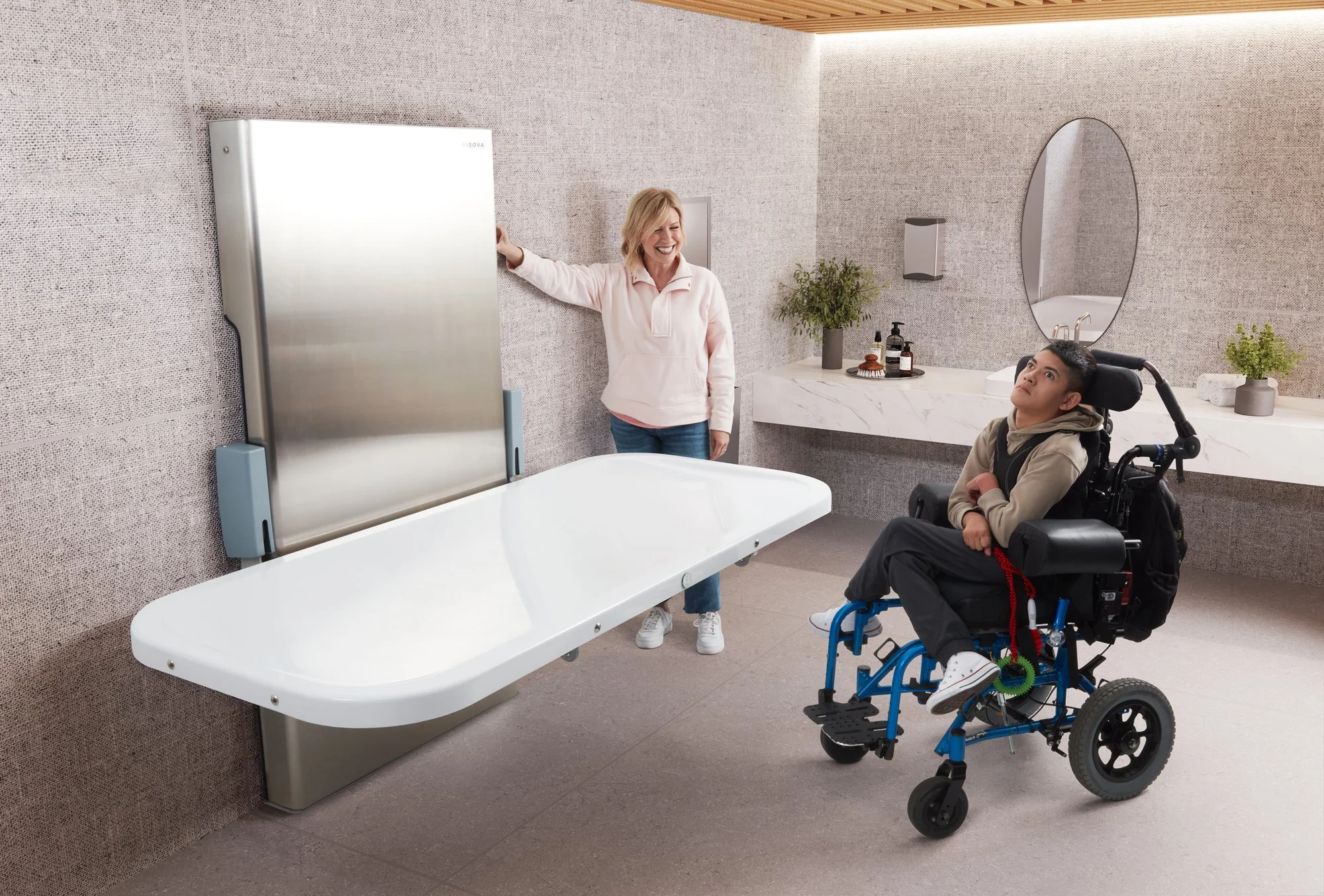
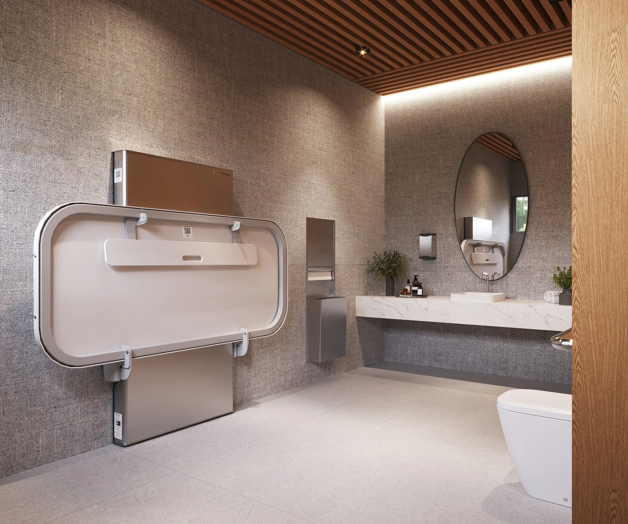
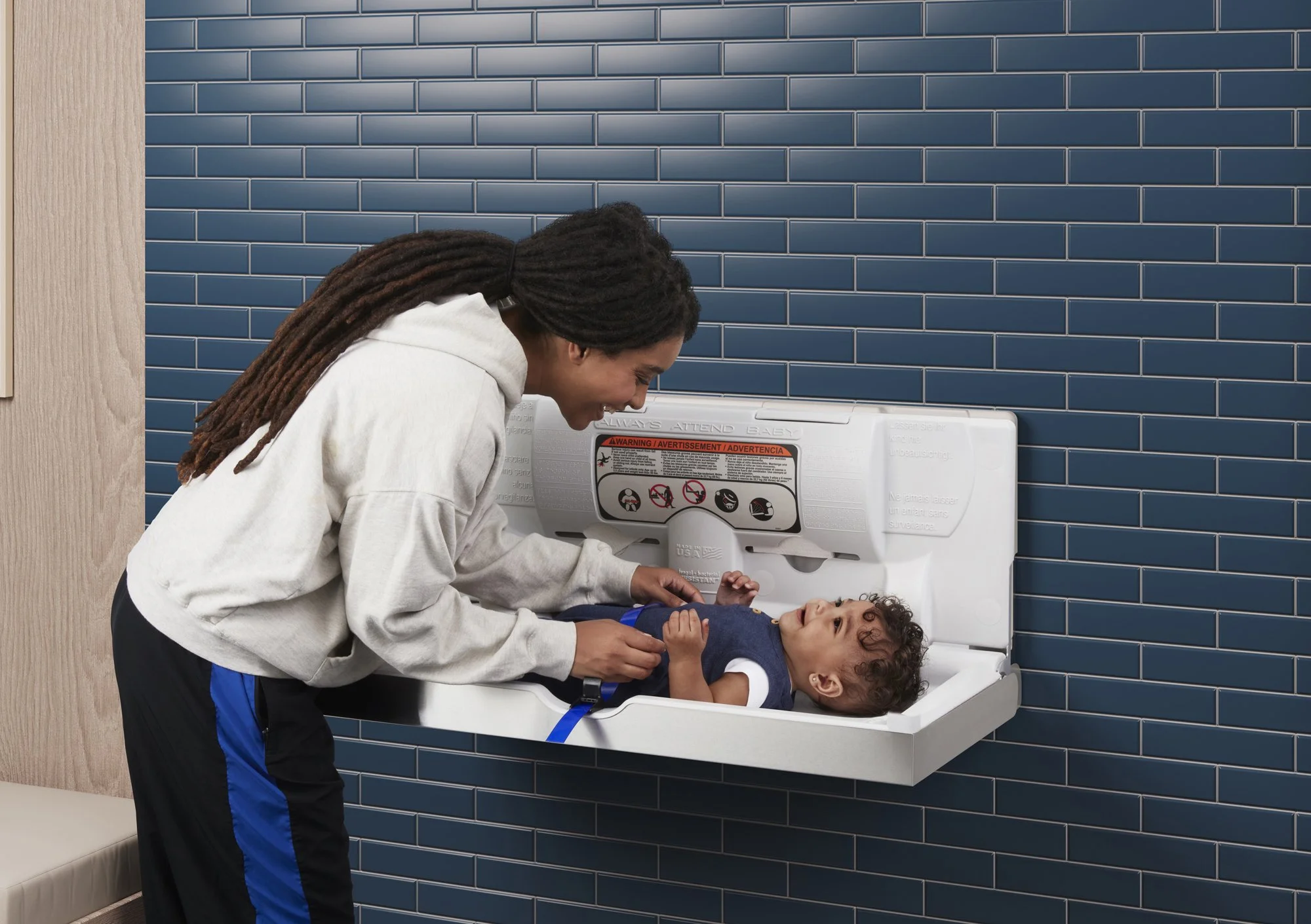
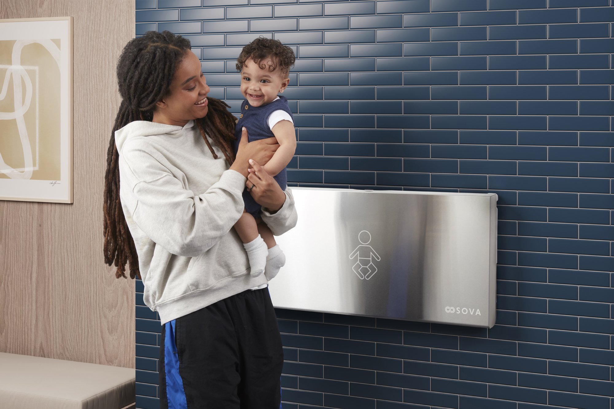
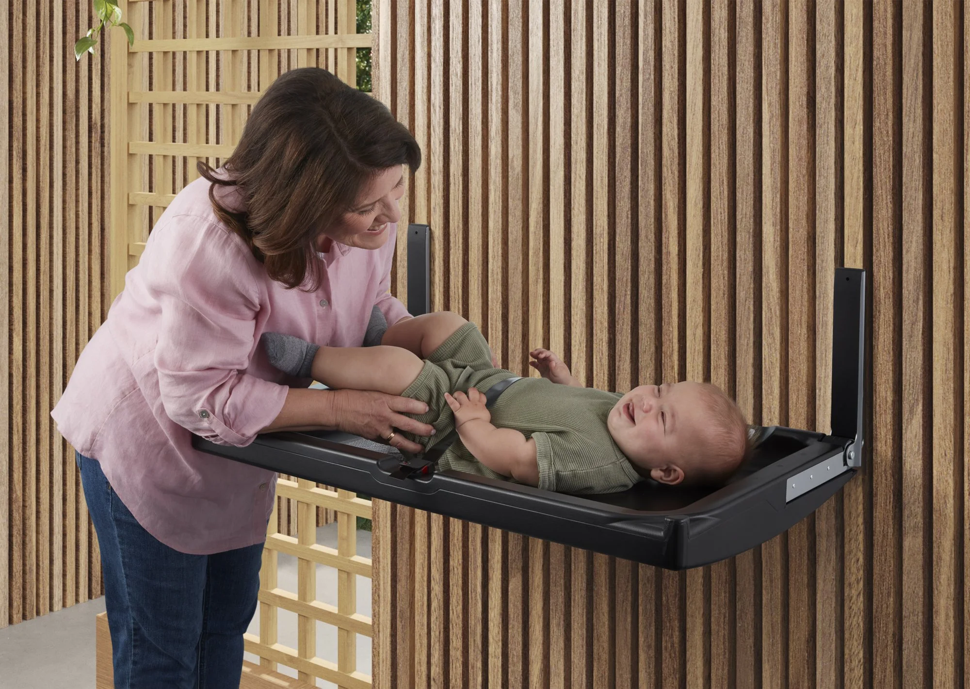
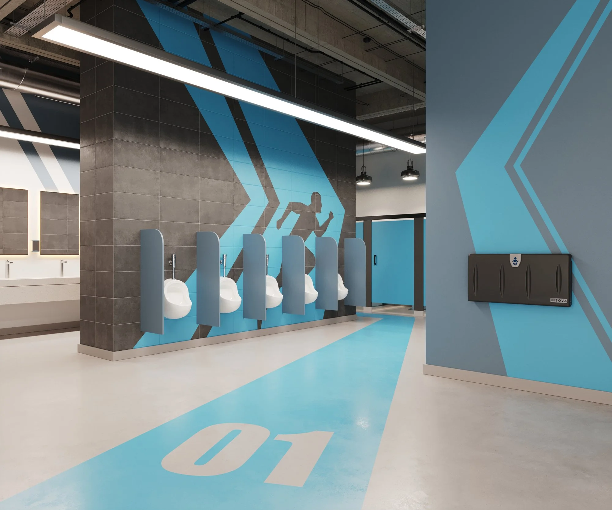
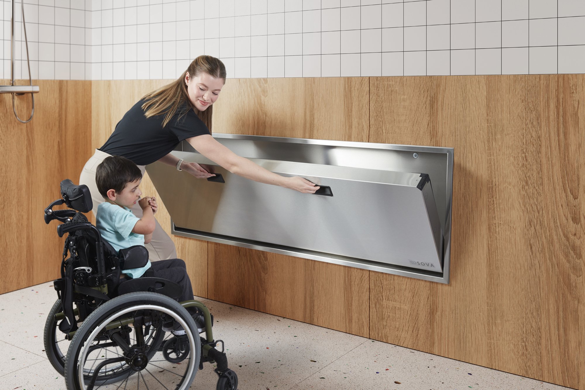
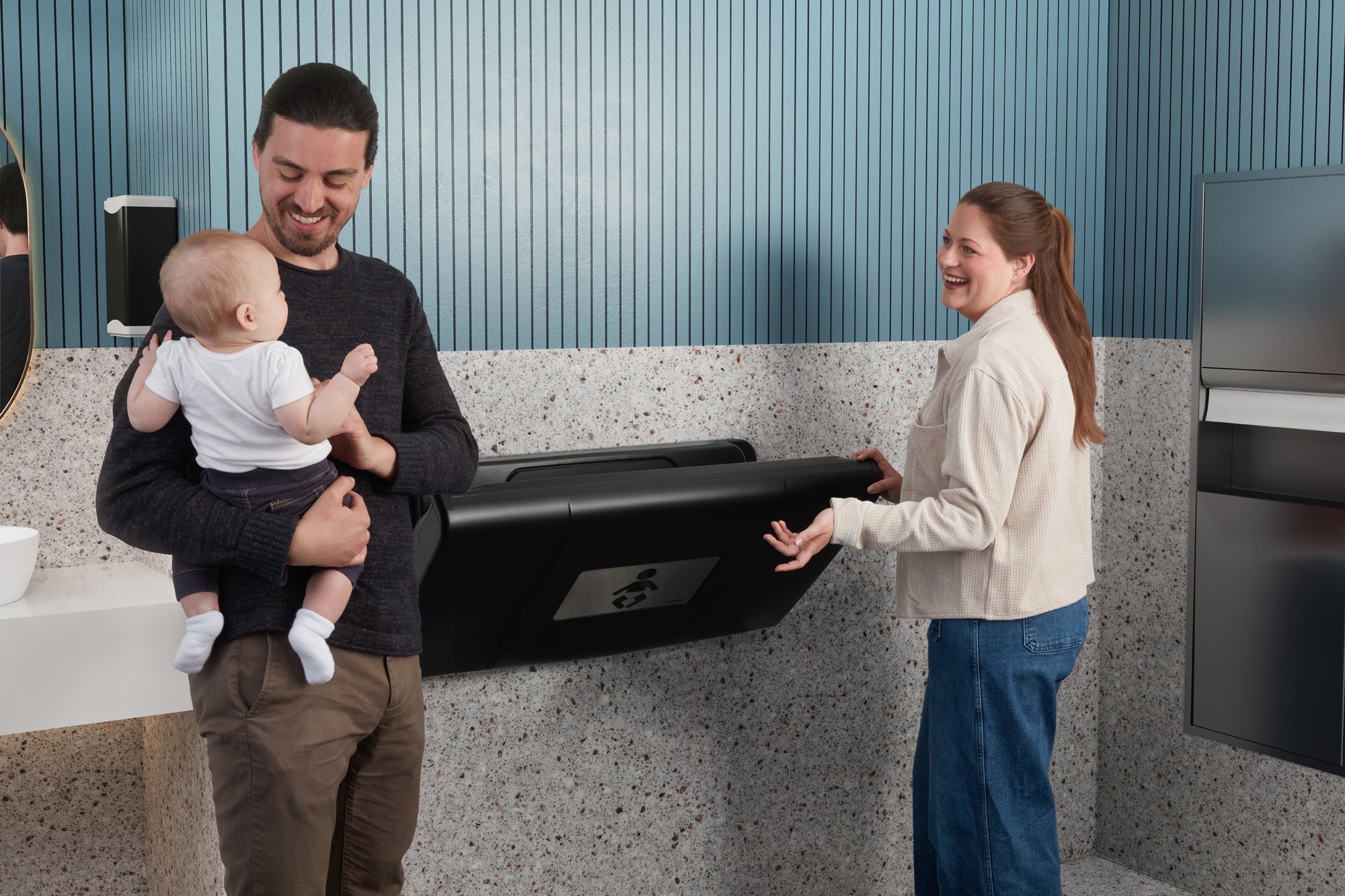
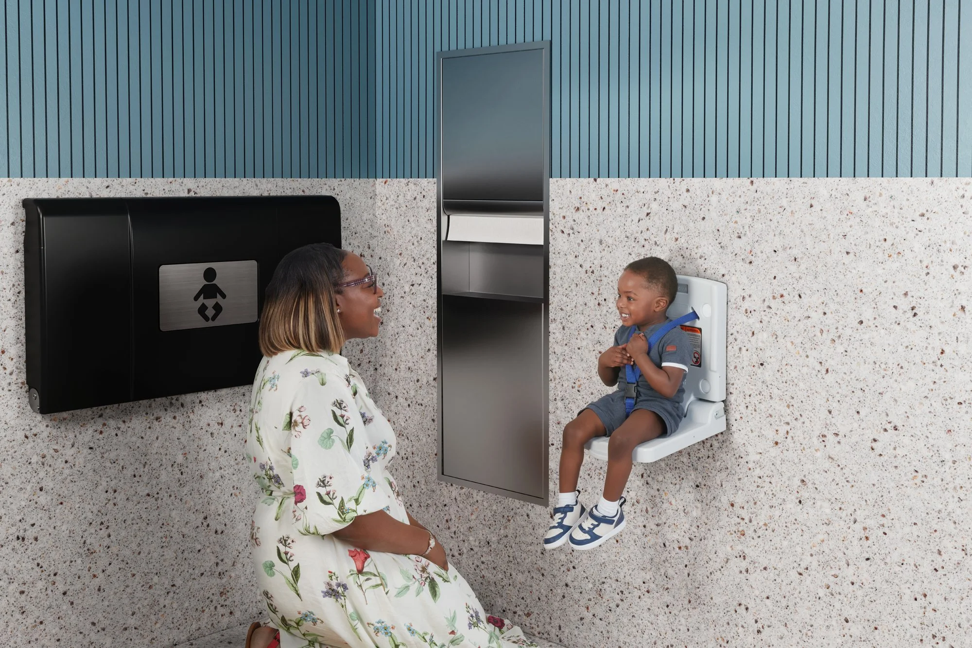
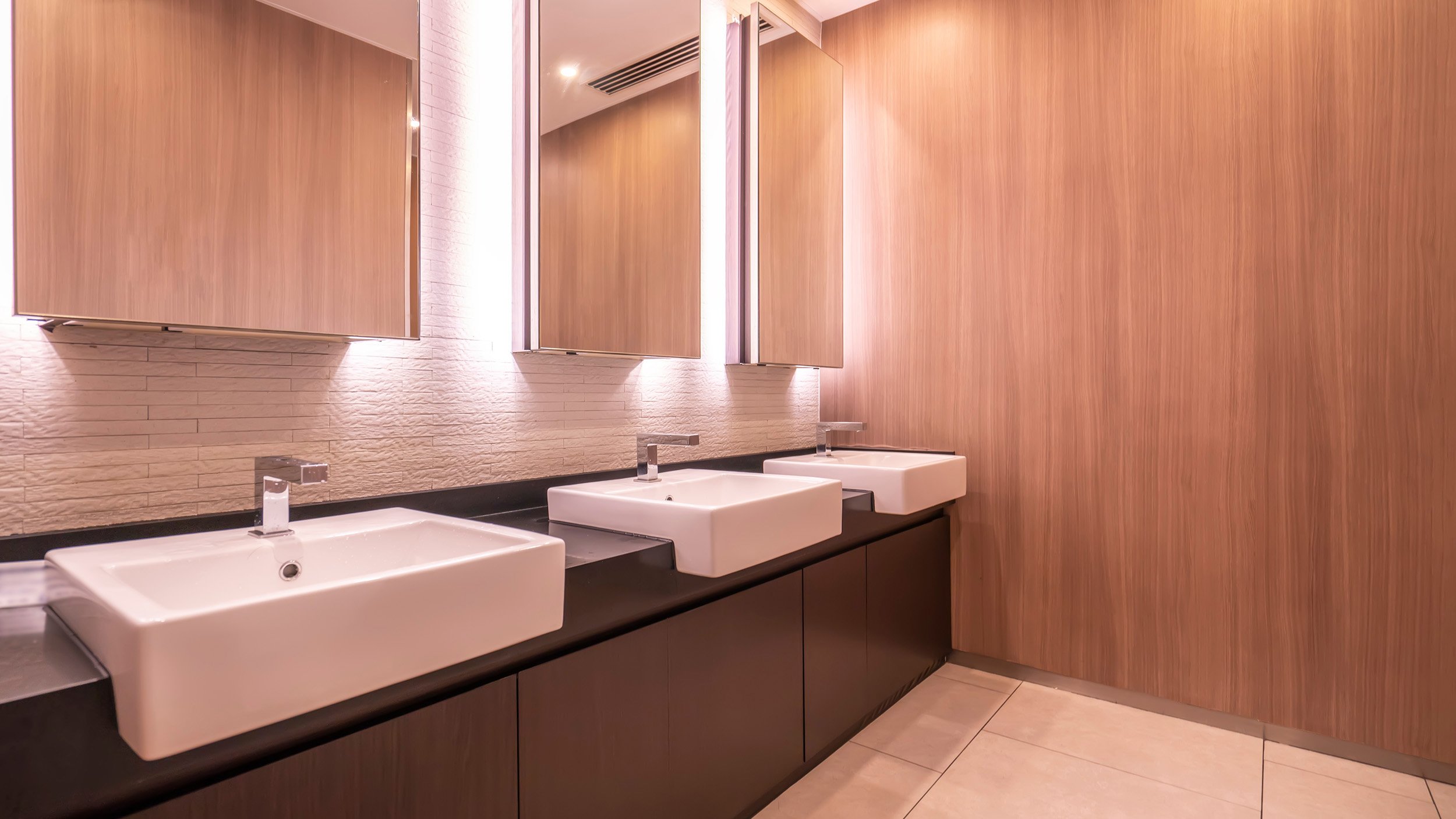
Photography
What does SOVA look like?
When taking pictures or selecting images, try to represent what truly sets Sova apart.
Our photography represents all facets of our care products. Photographs and images should always add meaning to and reinforce the point made. If you cannot easily convey the entire thought with just one picture, use two. Select photography and images that reflect the diversity of the people and businesses we serve.
Note: The images below serve as a reference for tone and quality. As new photos are taken, they should align with this benchmark and uphold our brand's visual standards.
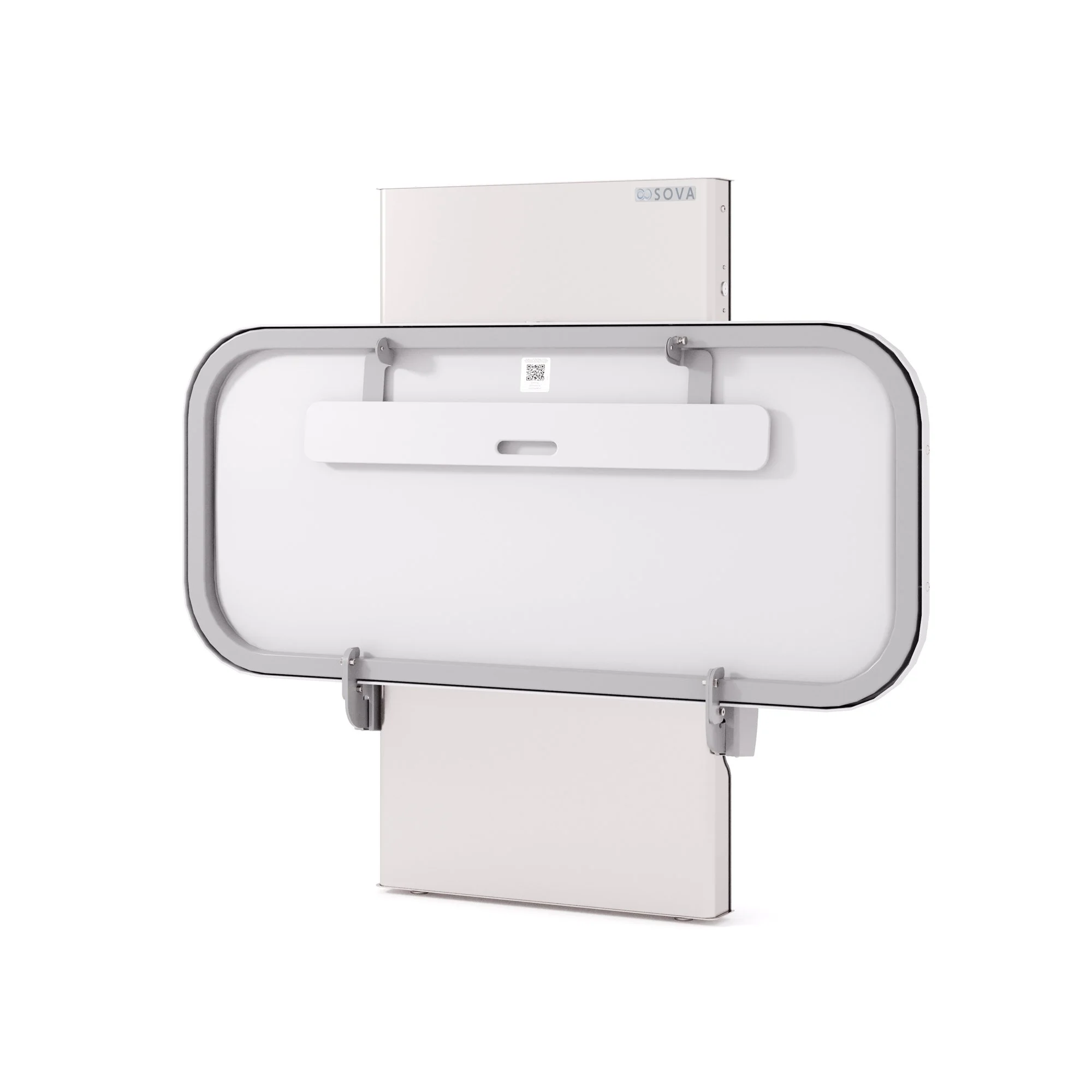


Logo Downloads
Choosing a File Type
The correct use of the Sova identity is one responsibility we all share. Reproduction artwork is provided for easy use. Before choosing the file format, confirm the final use of the logo.
Vector Files
Vector files are used for print reproduction and for incorporation into Microsoft software applications (e.g. Word and PowerPoint). Vector files may be scaled up and down within an unlimited specified size range. (EPS, PDF)
Bitmap Image Files
Bitmap files are composed of pixels for use on a display screen. These files are composed in CMYK (cyan, magenta, yellow, black) & RGB (red, green, blue) for use in interactive, video or TV applications. These files should not be enlarged, as a jagged edge will appear. Never use a bitmap file for print reproduction. (JPG, PNG)
Logo Library File Naming
Please refer to this guide for logo file naming.
(CMYK: Process Color, RGB: On-Screen Color, PMS: Pantone Color, REV: Solid White, BW: Solid Black and Greyscale: Greyscale)

The Sova Logo Library
This collection of logos should be utilized when referring to SOVA.


The Sova Company
Brand Strategy
Who We Are
Vision
To be the global leader in changing station solutions and redefine their role as an essential feature of modern, inclusive, and innovative public washrooms.
Mission
To deliver products that inspire confidence through superior design and engineering, uncompromising safety, and enduring quality—creating better spaces and experiences for all.
Value Proposition
SOVA makes the entire changing station experience seamless—delivering solutions that fit beautifully, function flawlessly, and simplify specification.
Product Attributes: Premium by Design
Safety
Exceed governmental safety standards.
“Non-additive” chemical-free construction promoting inherent hygiene and health benefits for children.
Innovative features enhancing caregiver confidence and liability protection.
Quality
Engineered and built in the USA with the highest-quality materials, construction and technical excellence.
Durable, long-lasting construction that withstands heavy usage.
Compliance with ADA, CPSC, and LEED certifications.
Aesthetic Appeal
Modern, premium designs that enhance modern washrooms.
Addresses gap in the market for visually appealing, sophisticated designs and products.
Comfort
Ergonomically designed for ease of use by caregivers.
Provides a comfortable and secure experience for adults, children and caregivers.
Easy to Use, Maintain and Service
Backed by exceptional customer service with fast parts delivery and responsive support to minimize downtime
Streamlined specification tools and accessible documentation ensure effortless planning for architects and designers.
Our Audiences: Benefits
Architects and Designers
A partner in their effort to develop spaces that make daily life better.
Products that are easy to specify and designed to improve both form and function.
Add value for clients by integrating high-value products into their designs, ensuring both practicality and visual appeal.
Distributors
Reliable products backed by consistent quality and support.
Ease of business with simple processes and responsive service.
Competitive edge with premium solutions that are easy to sell and resonate with diverse audiences.
Businesses
True value providing meaningful advantages for the investment.
Confidence in delivering inclusive, high-quality facilities that enhance their brand image.
Spaces that show concern and consideration for all customers and employees.
Reliable solutions that are easy to maintain and balance safety, functionality, and modern design.
Families/Caregivers
Spaces that make caregivers feel supported and respected.
Products designed to be safe, comfortable, and reliable for everyday use.
Key Messages
Core Values
Care More
A relentless commitment to creating products that improve the quality of life, from design and engineering to everyday use.
Uncompromising Quality
Products built to meet the highest standards of safety, durability, and aesthetics—ensuring trust and satisfaction.
Empathy and Inclusivity
A focus on creating spaces that care for all individuals, aligning with universal design principles and the dignity of every user.
Differentiators
Easy Experience
From specification to installation, we simplify the process, making it easier for architects and businesses to deliver better spaces.
Designed and Engineered with Purpose
Designs that improve the form and function of public washrooms- reflecting our deeper mission of care.
End-to-End Service
Better support for architects, distributors and businesses throughout every phase of their journey.
Key Messages: Emotional Resonance
A Brand That Stands for Care
We care about everything—from the products we create to the people who rely on them. More than just changing stations, our solutions are designed to deliver comfort, confidence, and dignity in every space.
Elevating Everyday Moments
Spaces become more than functional—they create connection, even if momentary, by showing concern for the needs of everyone.
Setting a New Standard
We’re redefining what a changing station can be—setting a new benchmark with modern, elegant design that doesn’t just work but works beautifully for everyone.
Brand Positioning:
Sova is the company that Cares More—focused solely on changing station solutions that improve the public washroom experience.
Sova is the company that Cares More—dedicated solely to changing station solutions that elevate public washrooms with thoughtful design, easy integration, and uncompromising quality.
Sova is quiet confidence—precision without pretense, elegance without excess. Every curve, line, and material is chosen with care, ensuring our stations blend effortlessly into spaces that feel intentional, modern, and welcoming.
Sova is more than a product—it’s a perspective. A belief that even the smallest details create meaningful experiences, that design should elevate without demanding attention, and that trust is built in every interaction.
At Sova, we care more. About the details. About the experience. About the people who rely on us every day.
Brand Voice
Empathetic
Our voice reflects a deep understanding of the needs of architects, businesses, and families, showcasing a commitment to creating spaces that prioritize safety, comfort, and dignity.
Aspirational
Forward-thinking and inspiring, we communicate how modern, elegant design transforms public spaces and enhances everyday experiences.
Sophisticated and Polished
The voice is professional and refined, reflecting the premium quality and meticulous attention to detail in our solutions.
Inclusive and Impactful
Engaging and respectful, we address the diverse needs of our audiences.
Brand Language
Identifier
The New Standard in Changing Stations
Changing Stations for Companies that Care
Tagline
More Than a Station—A Statement of Care.
A Statement of Care.
Headlines
A Brand That Stands for Care
Built to Care.
Care Without Compromise.
Changing Stations for Companies that Care.
A Moment of Care Can Change Everything.
Designed to Care. Built to Belong.
Elevating Everyday Moments
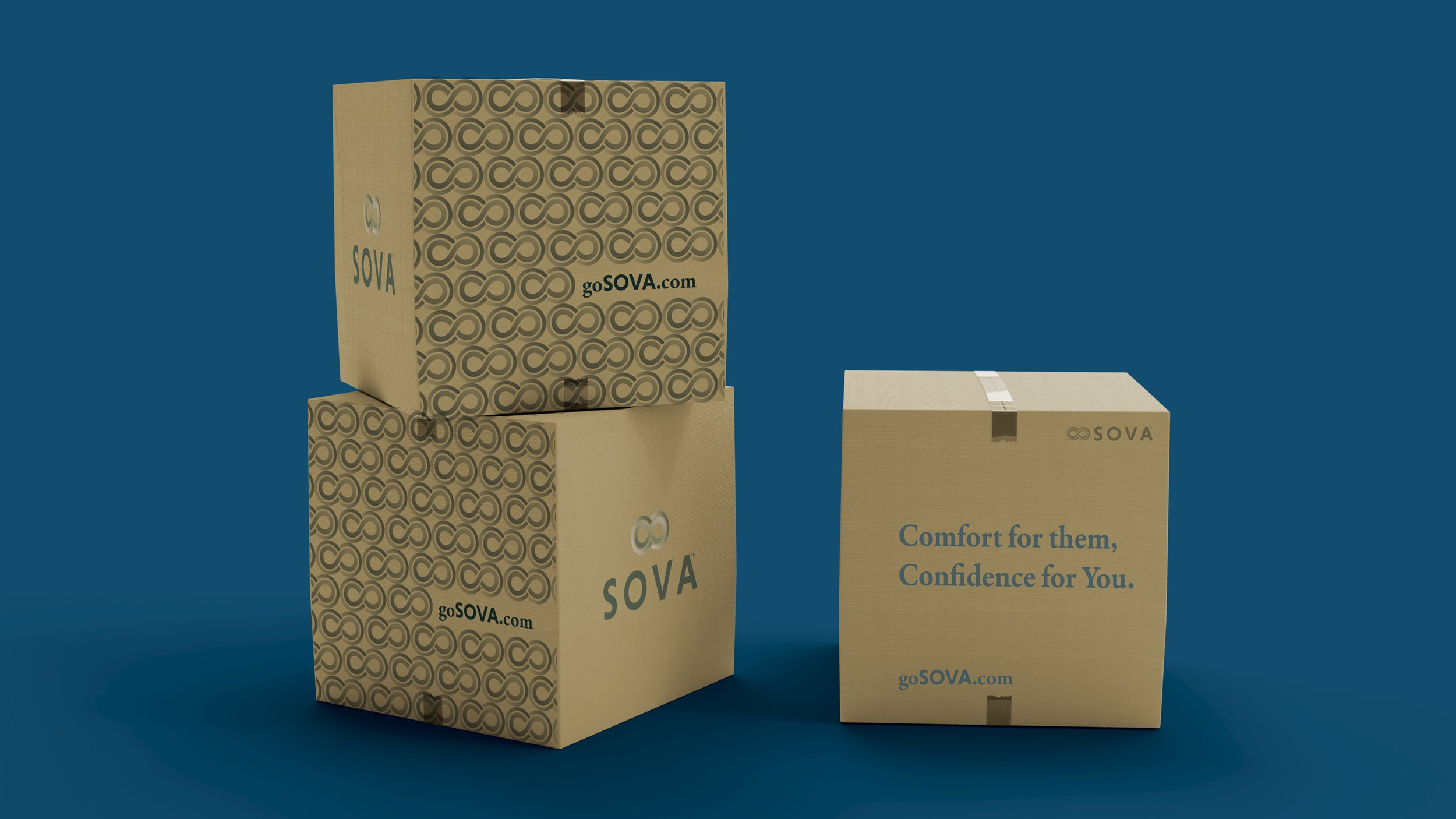
Comfort for Them, Confidence for You.
Small Moments, Big Impressions.
The Small Things Aren’t Small at All.
We Don’t Just Work—We Work Beautifully.
Overlooked to Unforgettable.
Setting a New Standard
Change the Station. Change the Space.
The Station Says It All.
The Right Station Changes Everything.
Changing stations, Changing Perceptions.
Invisible When It Works. Unmissable When It Doesn’t.
Headlines for Architects
Invisible When It Works. Unmissable When It Doesn’t.
Your Vision. Our Precision. Better Spaces, Together.
Designed to Blend in. Engineered to Stand Out.
A Great Space is Only as Good as Its Smallest Details.
Designed for People. Built for Performance.
Spec It Once. Trust It Every Time.
It’s Not Just a Spec. It’s a Statement.
Looks Good, Works Better. The Station Your Design Deserves.
Headlines for Distributors
Stand Out. Sell More. Sova.
Premium That Moves. Margins That Work.
Designed to Impress. Built to Endure.
Precision in Every Detail. Confidence in Every Order.
A Statement of Quality. A Strategy for Growth.
Flawless Craftsmanship. Trusted Performance.
Excellence, Order After Order.
Stock Confidence. Sell Assurance.
Headlines for Businesses
Looks Good. Works Better. Lasts Longest.
Smart Design. Smarter Investment.
Invest in Quality. Elevate Every Experience.
A Space That Welcomes Everyone.
A Better Experience for Every Guest.
Great Brands Think Beyond the Basics.
Your Brand, Built into Every Detail.
Your Space. Your Standard. Your Statement.
Spaces That Show You Care.