

Identity Guidelines
July 2023


The WGY identity system is comprised of:
The Primary WGY Logo Horizontal
The WGY Logo Vertical
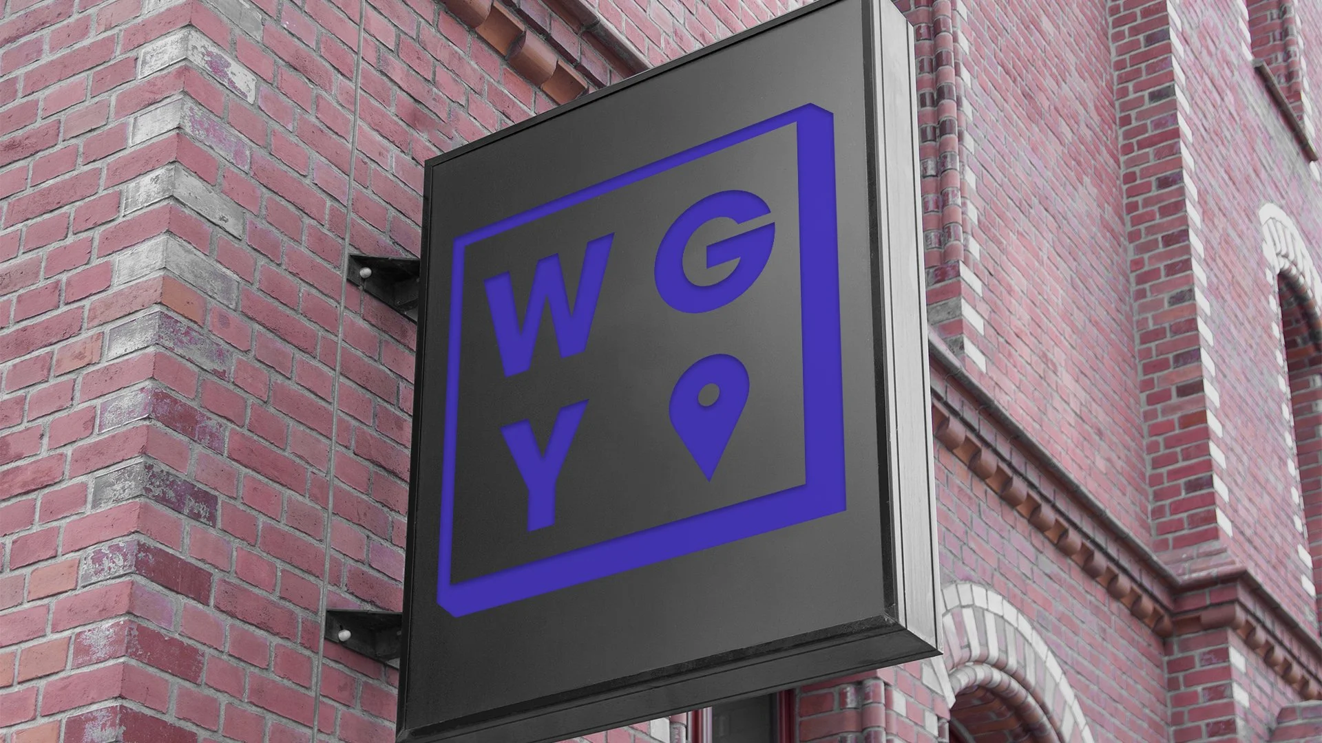
The WGY Logo Square
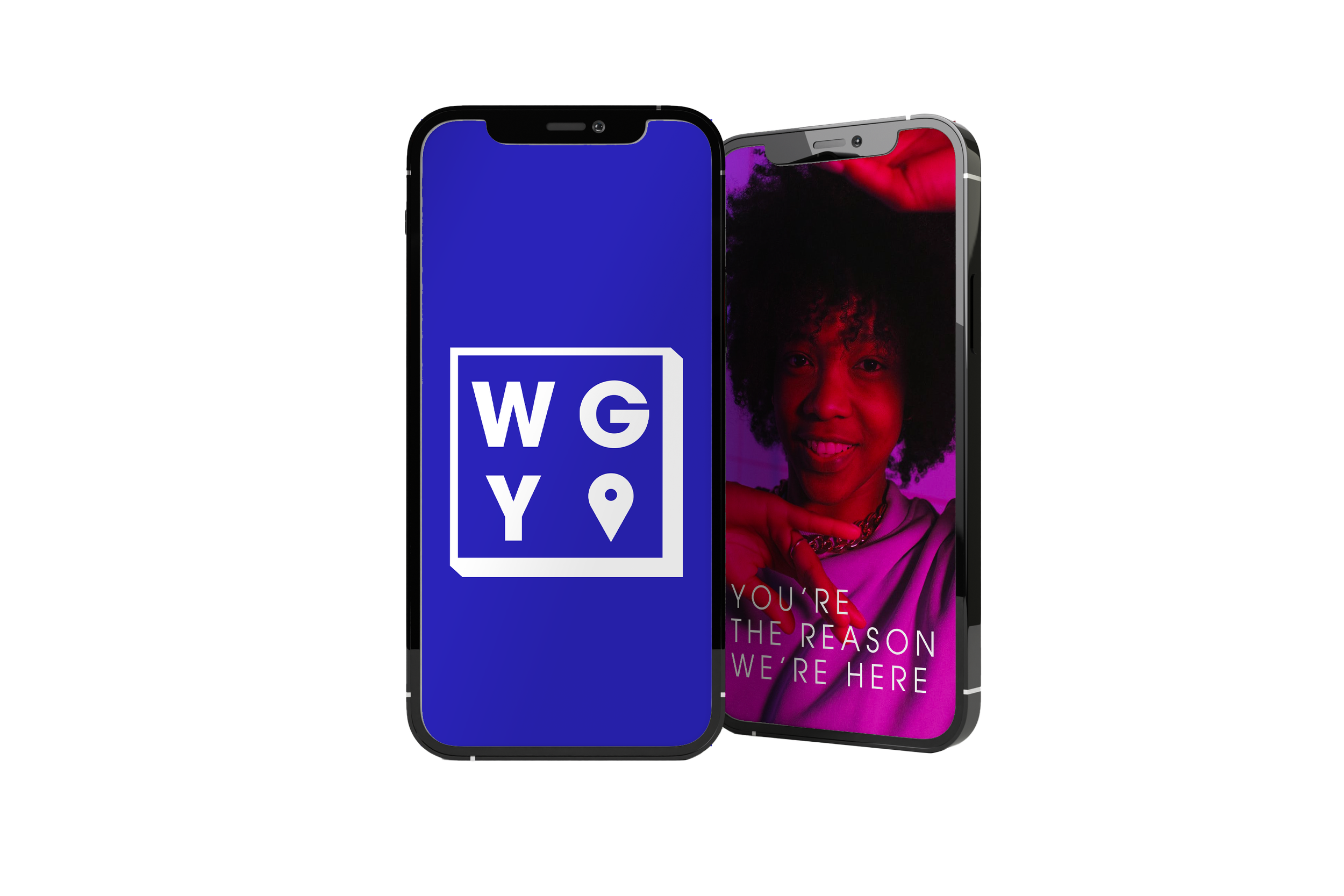
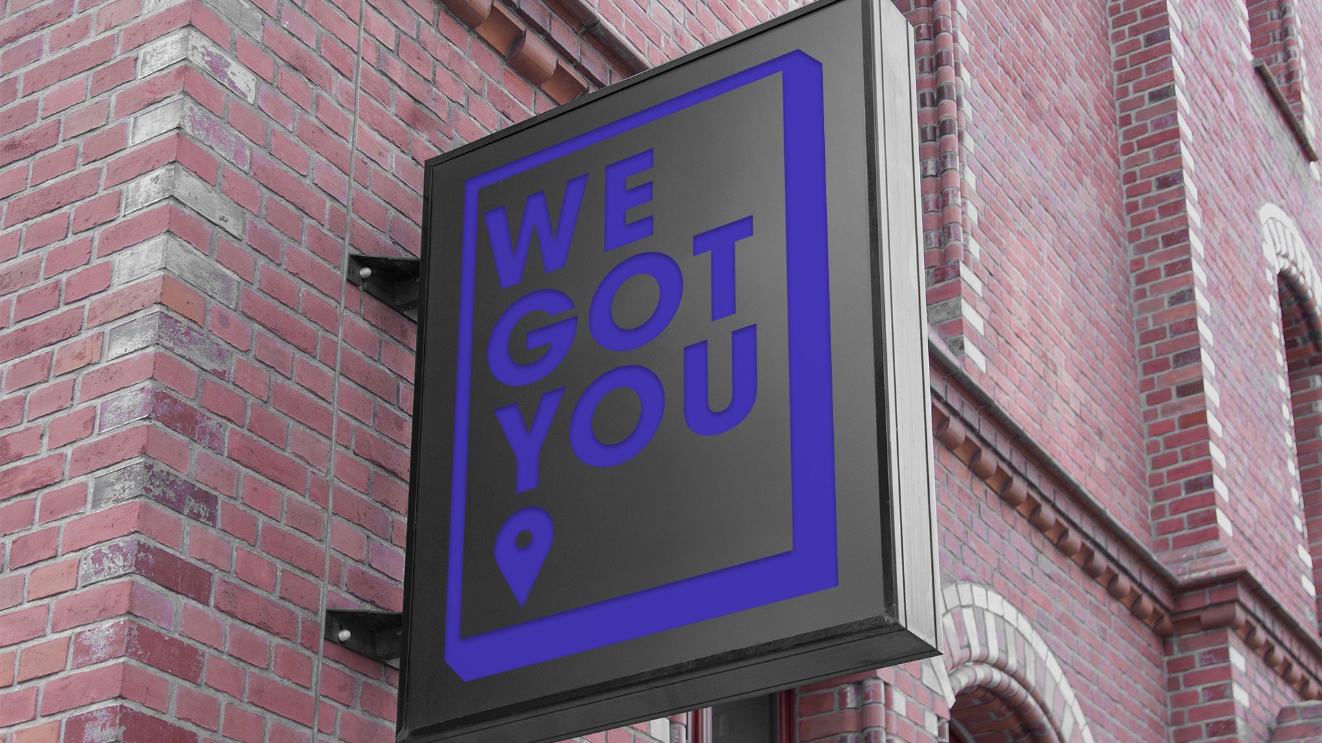
The We Got You Logo
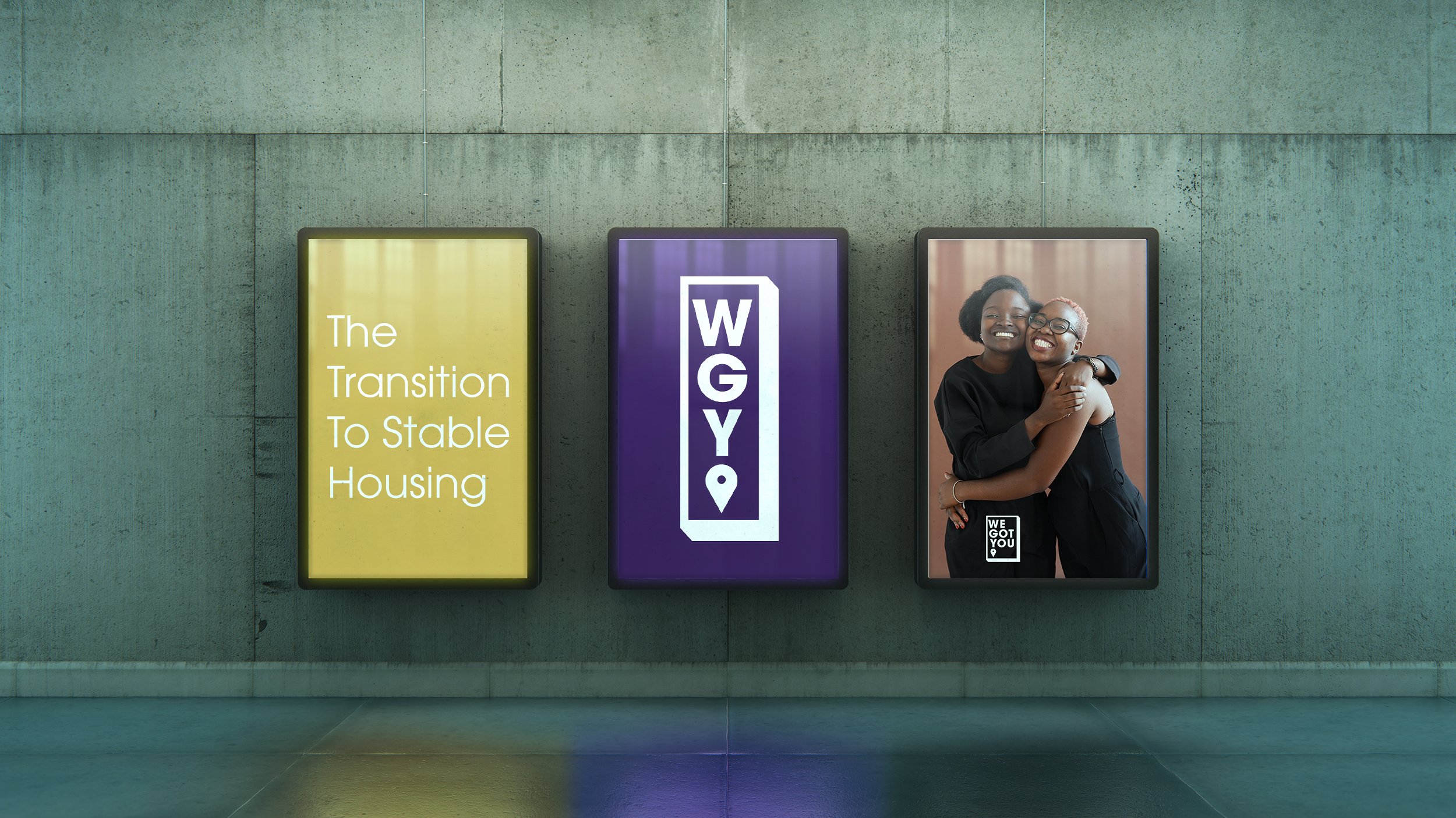
Use The WGY logo in instances referring to the youth drop-in center. The logo may be used wither with or without the tagline depending upon the level of discretion appropriate for that particular usage. For example, use logo without the tagline on apparel, or accosories that will be worn in public, but do include the tagline on explanatory collateral or advertising where explanation is useful.
The identity must be used on all corporate stationery items: letterhead, envelopes, business cards, and communications materials.

Color
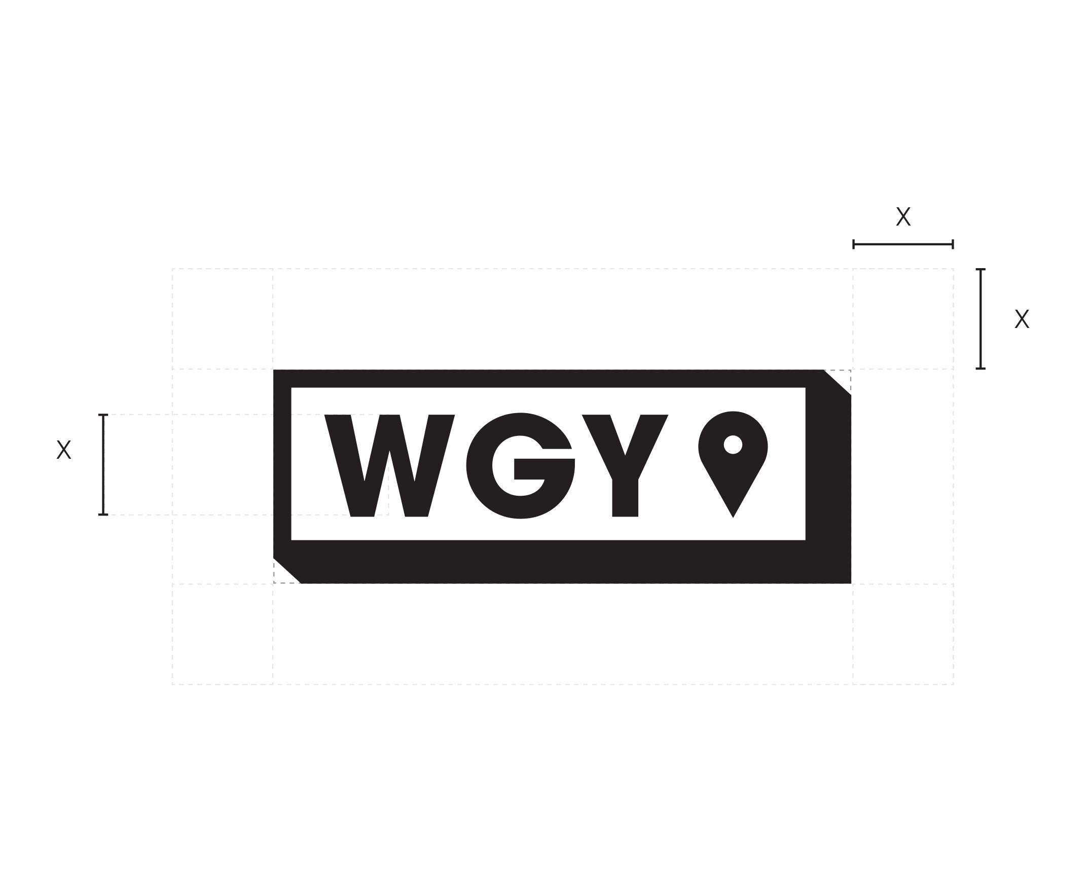
Area of Isolation
To create maximum impact, the space around the logo or logo mark should be free from other text and graphics. The area of isolation is the designated clear space around the logo no matter what size the logo is placed. When placing the logo on any material, the area of isolation must be accommodated. The guides represent this safety area.
In any of the versions of the logo, the X area of isolation is based on the height of the W in any version the Logo.
Color Application
The distinctive elements of WGY identity are further distinguished by the secondary color palette. Color plays a significant part in shaping the WGY brand. The secondary color palette consists of three colors, purple PMS 2597, blue PMS 2736 and yellow PMS 1235. The preferred reproduction is in matching inks. Swatches should be used for visual match in offset printing and other reflective reproduction techniques. Use the brand colors whenever possible, as this maximizes the impact of the brand and more effectively supports brand recognition.
The logo itself appears either as black on white, or white on a secondary color or an image.
Color Specifications
The Pantone Matching System (PMS) is a standardized color system that identifies nearly 5,000 various subtle color shades and variations. This detailed color numbering system allows designers and printing manufacturers to standardize and match colors correctly, to overcome the common variation of printed colors when using CMYK.
CMYK is a color space for printed materials. CMYK colors is a combination of CYAN, MAGENTA, YELLOW , and BLACK. This print method is used primarily for print advertising in magazines, newspapers and standard four color offset printing.
Electronic & Video
Color created through transmitted light on a monitor or a television screen is composed of three primary colors: red, green and blue (RGB). RGB color is produced electronically, the overall color quality will tend to be more vivid than the printed color.
Please note: electronic color is more subjective than printed color. Temporary changes of light source, reflection from adjacent objects, manufacturer and age of screen all affect the color appearance.
Color Palette
Please refer to the color chart when using the WGY identity colors. If the piece is part of a four-color process reproduction, the colors should be created with CMYK screen tints. If the identity is part of an electronic medium such as the web, broadcast or PowerPoint, the colors should be created with RGB values. Swatches should be used for visual match in offset printing and other reflective reproduction techniques. The preferred reproduction is in matching inks.
Primary Color Palette
The color palette consists of two primary colors, black and white.
Secondary Color Palette
The color palette consists of three secondary colors, light blue PMS 2597, PMS 2736 and PMS 1235. Please refer to the color chart when using WGY complementary colors.

PMS 2597
R=87 G=13 B=127
#570D7F
C=37 M=89 Y=0 K=45
PMS 2736
R=42 G=36 B=185
#2A24B9
C=83 M=75 Y=0 K=35
PMS 1235
R=250 G=193 B=0
#FAC100
C=0 M=29 Y=91 K=0

Reverse Treatment
The black & white logo is used for most applications in the WGY identity.

Usages to Avoid

Never violate the area of isolation.

Never add any marking signatures.

Ensure sufficient contrast for proper identification.

Never distort, recolor, skew or redraw the logo. Never alter the logo variations in any way.

Do not add shadows, glows, or any effect to logo.

Never diagonally rotate or flip the logo.
Typography
Typography
The typographic style relies on one primary font family. Different weights of ITC Avant Garde Gothic Pro can be used for headline and sub-headline applications, body copy and pull quotes. These typefaces are to be used for corporate applications such as the letterhead system and business cards, form titles, and signage. In addition, digital and print advertising should utilize the same typeface — except for campaigns.
ITC Avant Garde Gothic Pro is available for purchase at
myfonts.com/collections/avant-garde-gothic-font-itc
Typographic Hierarchy Demonstration

Logo Downloads
Choosing a File Type
The correct use of the WGY identity is one responsibility we all share. Reproduction artwork is provided for easy use. Before choosing the file format, confirm the final use of the logo.
Vector Files
Vector files are used for print reproduction and for incorporation into Microsoft software applications (e.g. Word and PowerPoint). Vector files may be scaled up and down within an unlimited specified size range. (EPS, PDF)
Bitmap Image Files
Bitmap files are composed of pixels for use on a display screen. These files are composed in CMYK (cyan, magenta, yellow, black) & RGB (red, green, blue) for use in interactive, video or TV applications. These files should not be enlarged, as a jagged edge will appear. Never use a bitmap file for print reproduction. (JPG, PNG)
Logo Library File Naming
Please refer to this guide for logo file naming.
(CMYK: Process Color, RGB: On-Screen Color, PMS: Pantone Color, REV: Solid White, BW: Solid Black)

The WGY logo library with and without tagline
This collection of logos should be utilized when referring to the WGY.


The WGY Brand
We’ve Got You…
Kicked out of the house. Aged out of foster care. Not enough for rent. What now?
When a young person is facing housing instability, the uncertainty can be overwhelming. We know because we’ve been there. And that’s the reason we want you here. Welcome to WGY, a safe and secure space designed by young people for young people seeking guidance and support on their way to a stable address.
Young people need a dependable place where they can rest, recharge and take care of the basics like food, clothing, laundry and showers. They need access to health, referral, enrichment and other supportive services. They need the comfort of an accepting community and a hand in navigating the uncertainty.
Through radical hospitality rooted in lived experience, WGY serves as a warm, welcoming environment where young people can work through their challenges and hold on to hope. WGY helps put young people on the path to stability and success, no matter who they are or how they got here.
OUR MISSION
On the Way to a Stable Address
Make WGY the perfect transition point for young people facing housing instability to lay low, learn and leverage navigators’ knowledge to improve their housing situations.
OUR POSITION
Radical Hospitality Rooted in Lived Experience
Because we’ve been there, WGY is able to provide a safe place designed specifically to offer comfort and guidance to young people to overcome their housing challenges.
BRAND STRATEGY
No matter a young person’s background, WGY offers a sense of home with the familiarity, predictability, safety and unconditional acceptance needed to get through difficult times.
OUR PROMISE
Young people facing housing insecurity will always have stable ground on which to stand, a place to go where they can relax, enjoy, and experience the feeling of belonging.
BRAND NARRATIVE
You’re the reason we’re here
Young people turn to WGY in times of crisis because they know that they’ll find people who care and won’t let them fall. They know that we understand, offer support, and are a safe place to be for as long as they need.
VALUE PROPOSITIONS
Where You Belong
Young people turn to WGY in times of crisis because they know that they’ll find people who care and won’t let them fall. They know that we understand, offer support, and are a safe place to be for as long as they need.
VALUE PROPOSITIONS
Where You Belong
For young people feeling isolated or alone, there is a place they can go where the outside world is absent; where they are validated, and others share their experience; where they are given respect and are treated with dignity; where they have hope; where they belong.
Walked in your shoes
Staffed by individuals with lived experience. Navigators are a valuable resource to young people as they introduce them to local resources and offer first-hand, invaluable knowledge.
Attainable, within reach
All a young person needs to do is choose to be here. That’s it. There are no barriers, nor expectations to participate in any programs. We aren’t a treatment, rather a place where young people can be seen and treated as an individual.
The Essentials
Access to food, shelter, clothing, hygiene items, laundry facilities, showers, and safety. By taking care of the basics, young people can stay strong, motivated and hopeful in their transition to stability.
Beyond the Essentials
Resources for the next steps towards well-being, including socialization, transportation, health care, employment, education, addiction services, legal aid, health & wellness, and enrichment.
